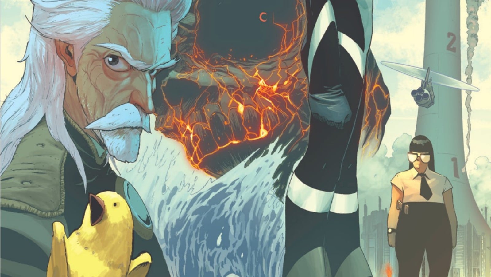
When his megacorp power plant falls under attack by terrorists, the super-scientist who revolutionized and controls all energy on Earth sends his ultimate creation (and an adequate employee) in to destroy his most monstrous secrets. Find out what happens next in Ghost Cage #1, drawn by Nick Dragotta, written by Dragotta and Caleb Goellner, and lettered by Rus Wooton for Image.
In a 1992 interview, Image Comics co-founder Todd McFarlane said, “It doesn’t really fucking matter what people write, then, because if I can do it, and I can sell 1,000,000 copies with bad writing, then what the fuck is the problem?” The company was founded by former Marvel artists who were tired of, let’s be honest, mediocre writers taking a cut of the pie when their art was far and away the selling point of the books. Anyone could turn in Amazing Spider-Man #325 and have it sell with Todd’s art on the cover. Ghost Cage #1 is the latest entry in that grand Image tradition.
What Nick Dragotta accomplishes visually here is nothing short of remarkable. Dragotta’s exaggerated characters and striking designs make an immediate statement. There is a heavy use of pin-ups to introduce our cast, powerful pages that go a long way to establish the scale and personalities for these friends and foes. Other pages are dense, featuring tight, kinetic action while grounding the atmosphere.
Take a look at the opening battle between Sam and Coal. It starts open, a widescreen comics page, the camera creeping into the object of Sam’s focus. It slowly guides us through the claustrophobic mines by switching things up into pages with a double digit panel count. These are framed tightly, with many panels in ultra close-up. We get the detail and anatomy of both Sam and Cole but don’t have a sense of scale until the page turn. Here, Dragotta lets loose with a towering figure that builds an impending sense of doom. Halftones layer depth upon the beast. It’s a sight to behold, a moment of quiet before the storm.

Dragotta wants the action to feel fast. Characters rush toward one another, now framed as equals. Our protagonist, Doyle, is shown removed from the action, highlighting her insignificance in the face of the proceedings. The hyper-detailed chaos of the ensuing explosion takes your breath away. We are dealing with factors beyond our control and comprehension, and Dragotta makes that explicit with his visual storytelling.
Also a highlight is Rus Wooton’s lettering. With Ghost Cage leaning heavily on the manga aesthetic of the art, Wooton’s letters walk a tightrope, and walk it well. You’ll notice the balloons are thinner and taller than in most comics, but unlike a scanlation forcing English letters into balloons built for kanji, Wooton takes care that the dialog fits naturally. It evokes Eastern comics while optimizing the style of an English language book.
The visual flourishes in the book also help it stand out from the crowd. The bold, oppressive letterforms for the character introductions reinforce the industrial grime of the title. The sound effects blend seamlessly with the art, they are thoughtful and additive, evoking the onomatopoeia. There’s a strong case to be made that this is what lettering should strive to be.
And what of the story? It’s Enter The Dragon by way of Akira. A tournament arc browbeating readers with reminders of the evils of capitalism and the endless pursuit of energy. It’s a vehicle for Dragotta’s artistic showcase. Us talking heads, writers ourselves, often call disciplines like coloring or lettering an “invisible art.” That implies that those artforms have value even if that value is more functional than anything else. At worst it’s a statement that means they didn’t get in the way of the stuff we bought the book for. If we can accept that for other, key components of a comic, why can we not accept that for writing?
Ghost Cage #1 is the kind of comic Image should be publishing. It’s a bold visual statement that pushes the envelope and can open readers up to stories they might have never given a chance otherwise. It oozes cool in the same way Spawn and Youngblood did at the company’s inception. It’s a reminder that for as much press as writers get, a comic lives and dies by the artist. It doesn’t really fucking matter what people write when it looks this damn good.
Zachary Jenkins co-hosts the podcast Battle of the Atom and is the former editor-in-chief of ComicsXF. Shocking everyone, he has a full and vibrant life outside all this.


