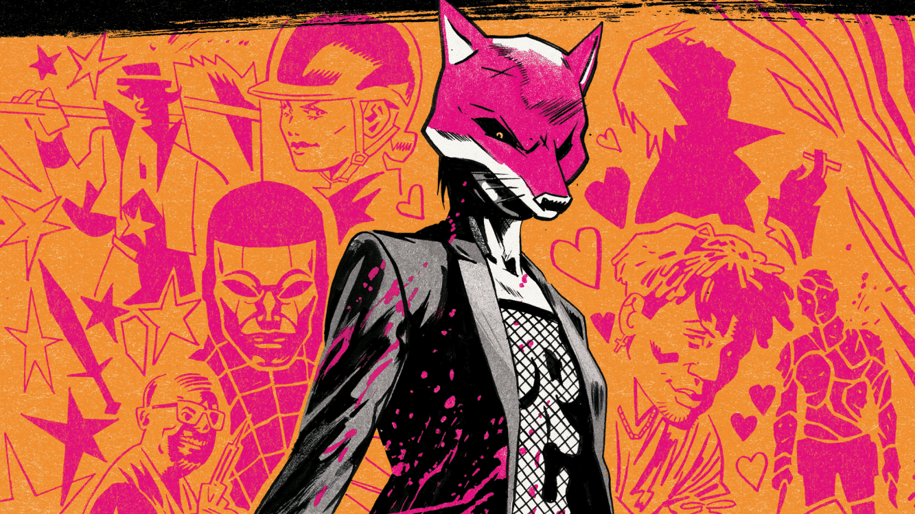
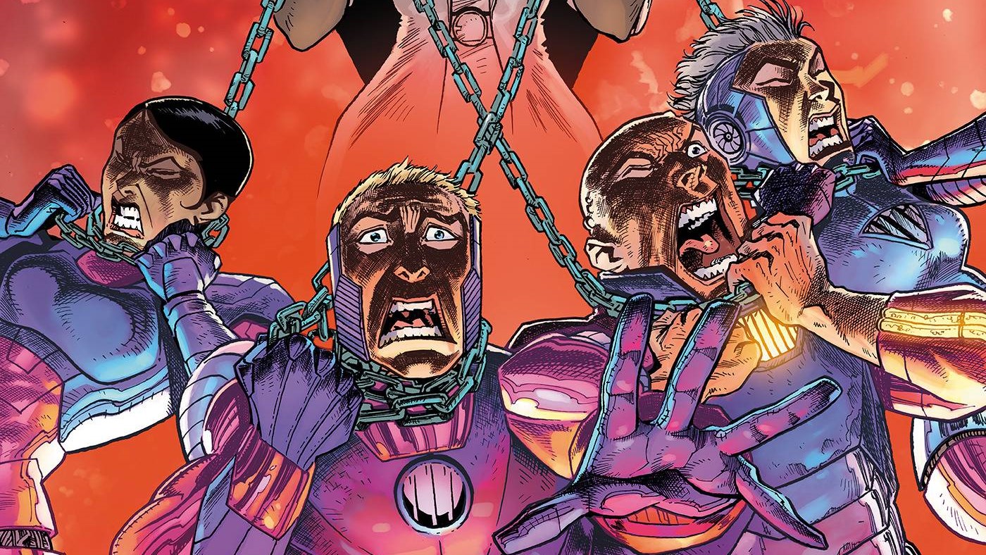
Tie us up and twist our nipples, why don’t you, if you’re going to end Hit Me #5, written by Christa Faust, drawn by Priscilla Petraites, colored by Marco Lesko, lettered by AndWorld Design and published by AWA.
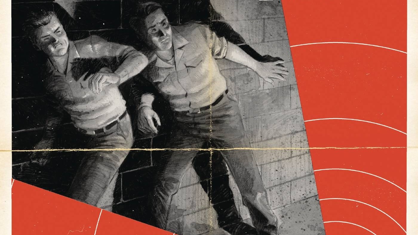
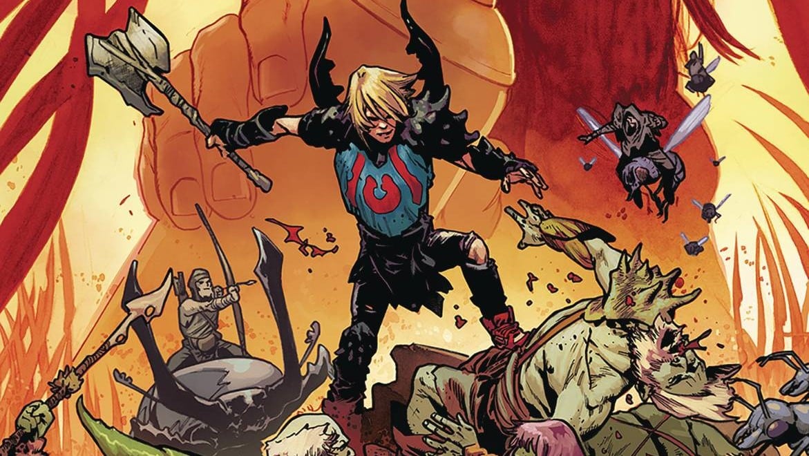
We’re on a mission of revenge, and our imaginary talking bird is just eggin’ us on in Above Snakes #1, written by Sean Lewis, drawn by Hayden Sherman, lettered by Hassan Otsmane-Elhaou and published by Image.
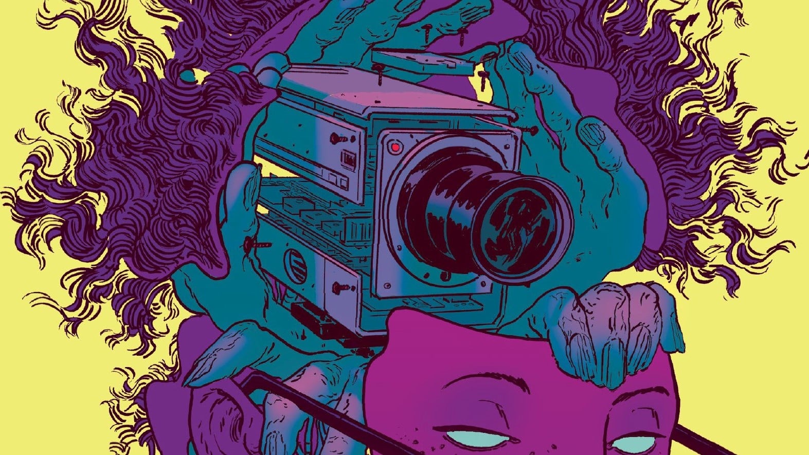
Teetering on the edge of darkness and about to fall in. All that’s staring back is the glaring red light of the camera in Blink #1, written by Christopher Sebela, drawn by Hayden Sherman, colored by Nick Filardi, lettered by Frank Cvetkovic and published by Oni Press.
Will Nevin: Ian, unfortunately, we have to say goodbye to one of our Freshest Chickens, as Hit Me departs for other, better comic refrigerators as it wraps up with its fifth issue. Newburn won’t be back for a few months, and I don’t know that I’m smitten with any other book at the moment. Is life just hollow and meaningless now? At least we have another anthology roundup next week.
Ian Gregory: Will, sometimes you’ve gotta take the chicken out of the fridge before it sits too long and starts to smell bad and then you get worried about what it looks like so you leave it in even longer out of shame. Uh, I mean, it’s better that a series ends when its time comes rather than drag things out unnecessarily. That said, Hit Me ending and Newburn being on break does mean that we have an open slot for our favorite ongoing. Who knows? Maybe an even tastier chicken could be lurking just around the next corner.
Will: Way to be positive as we all wait to die!
Hit Me #5: Ending This Series Is a Form of Kink Shaming

Will: Let us begin with the dearly departed. This final issue is a bit different than its brethren in that there’s less character development of Lulu and her world (although there’s certainly a bit of the latter as she explains the concept of “subspace” — and, no, we’re not talking Trek technobabble here, nerds) and more of a push to simply finish the plot — one that resolves rather neatly, with no loose ends left to trouble our half-naked heroes. What did you think of the finish here?
Ian: It’s a conclusion that feels very well earned. Lulu is leveraging a skill we’ve seen her employ all series — her pain tolerance — to set up a plan we know she was working on last issue. Even knowing all these component pieces, seeing it all come together, and watching Lulu finally get the upper hand on Mann, is extremely satisfying. Sure, there’s less focus on the kink than the crime in this issue, but on balance, I think this is a great way to wrap things up.
Will: In addition to the story closing out, we also get a lot of action in this issue. I thought the set piece of an abandoned boxing ring exposed to the elements was a fantastic choice visually.
Ian: I like that Lulu easily escapes from their bonds — because their captors are terrible at tying rope, something that Danny exploited in issue #3. The gunfight is chaotic and confusing, but I don’t really mind given the nature of the scene. I really liked the coloring by Marco Lesko during this fight scene, which evokes the kind of cut-paste effects you see in crime movies — I don’t know exactly what this effect is called, but it’s what you see parodied on the cover of Fiasco.
Will: I can’t say there’s a natural direction for a second chapter to go in (Again, most everything does get resolved), but I wouldn’t mind it. Here’s a thought to put into the universe: What would happen if Lulu falls in love with someone who’s 100% … vanilla (and then also gets wrapped up in some incredibly dangerous murder plot)?
Ian: I got a good laugh out of the ending, when Danny suggests they finally go get those oysters. It speaks to how brain-fried they both are that all they really want to do is eat. I think an interesting component to this series has been that we actually know very little about Danny’s preferences — he’s essentially a damsel in distress for most of this book. For all we know he could be totally bland in bed, but it’s Lulu’s interiority that keeps things moving.
I think Faust and Petraites have done such a good job with Lulu as a main character that you could put her into a lot of different situations and still have a compelling series.
Above Snakes #1: A Cool, Crazy Talking Bird with Only a Little Bullshit

Will: Let’s start with something different: lettering. What I want in comic book lettering is professionalism. Most self-published, “Sure, I can do my own lettering” books are unreadable because of the slapdash lettering that screams amateurism. On the other hand, when we get a letterer who decides to go absolutely fuckin’ crazy, the comic just seems silly. In this issue here, even the standard lettering hits me the wrong way (Too … graffiti-esque? Too … comic sans? Words fail me, but I hate it), but when Otsmane-Elhaou has different lettering for normal dialogue, narration and the voice of the imaginary, blood-thirsty bird in addition to his usual … flourishes … it’s too much for me. Calm the fuck down. Let the pencils, inks, colors and the writer tell the story. Be less fucking intrusive.
Ian: Hmm. In general, I agree with you, especially about amateur lettering. I actually have a whole diversion about this, which is that it isn’t that hard to learn bare-bones, competent lettering given that random forum dwellers have been fan-lettering fan-translated manga for the better part of 20 years, but that’s not really the point here.
I’ve certainly had my frustrations with overly complex lettering, especially on fellow Otsmane-Elhaou series Black Stars Above, which features literal pages of cursive handwriting, but I didn’t have any major issues here. I think the first two pages are a little too cute, but I actually liked Speck’s different speech bubbles. I liked the flashback speech bubbles being sepia, instead of white, and I didn’t mind the different lettering types (There’s typewriter text in captions, all-caps text for regular dialogue and title-case text for Speck).
This stuff does get on my nerves with regularity, but it didn’t happen here, maybe specifically because this is a western and I felt like the lettering matched the outdated feel of the setting.
Will: At least you agree with my gripes in principle. Those complaints aside, this was some wild fun. I love a good revenge story, and while this one comes with a side of zaniness, I don’t think it’s enough to blunt the impact of the violence. This is a weird-assed book (See above and “voice of imaginary, blood-thirsty bird”), but I think I like it.
Ian: It’s certainly got all the hallmarks of a classic western. Mysterious man blows into town, fights corrupt local warlord, etc., etc. That said, I liked Dirt’s vaguely confused demeanor, the action was good and I’m interested in the setting, particularly the “Loser’s Bar” of cowboys wandering the Earth looking for revenge. It only barely verges into the humorous, but always pulls back just before it would undermine the rest of the story. I’m definitely a fan.
Will: Outside of the lettering, this is an outstanding book visually. Sherman’s work is incredible, and the panel with the guy’s face reflected in the knife blade? Amazing.
Ian: Oh yeah, that knife reflection was slick. Love the colors, which feel very painterly. On some pages, there’s up to four major color expressions, which can sometimes make a book feel chaotic or disordered, but I felt it worked very well with the art here. I love the page of Dirt riding into town — that’s a moment you absolutely have to get right if you’re doing a western.
Blink #1: It’s Creepy, It’s Kooky, Mysterious and Spooky

Will: Hey, whaddya know, it’s more Sherman. Amazing what a different colorist can do with the same artist’s work, huh? Above Snakes (colored by Sherman) is wild and unbound, but Blink is more restrained — not better or worse but definitely different. Blink also feels more experimental in the layouts. Again, fun to track the same artist in different books and environments.
Ian: Two great series by Sherman this week. You’re right about the coloring, too. Filardi puts a bit of a green filter on things at the end that gives the book a Blair Witch or Paranormal Activity vibe. Huge ups to Sherman on the digital effects on the security camera feeds, too, which are incredibly spooky and well-detailed. They also pull back fantastically for that big two-page spread of the rowhomes, which is excellent. There’s a lot of really varied, really excellent work happening here.
Will: OK, I know the last time out, you laid down your increasingly demanding framework for what makes a good horror book — or at least one that feels compelling to you. Do we have that here? I have a sense of what you’re going to say.
Ian: Last week I very haphazardly declared that a good horror comic has to succeed in creating interesting characters, having a compelling premise and having striking visuals. I say “haphazardly” because these criteria basically boil down to “write a good comic book,” but I’ll stick with them here. Blink has amazing art and coloring, no doubt. The sleep paralysis scenes are creepy, the environments are detailed and compelling, and the digital effects give it a nice twist. The concept is great, too — we all have these half-remembered scenes from childhood, places we aren’t sure were real or invented. Wren’s is just significantly more traumatic — and haunted. I also like the digital undercurrent that runs through this book, and that it’s more in service of the plot and not as hamfisted or moralizing as in something like, say, NewThink. Lastly, character: Wren is, of course, relatable to us as he is a freelancer. That said, I find his particular brand of neuroses to be painfully familiar, including the way he overworks himself to the neglect of everything in the outside world. He’s not such a tremendous jerk you don’t want to read about him at all, but he’s certainly got Things Going On that make him complex. I also like his urban explorer friend, who is definitely going to die in like, 10 minutes, tops.
Will: Finally, what do you think the big story is here? Where are we going in this series?
Ian: We’ve got a pretty big mystery to unravel with this cult/militia/whatever, and I’m interested to see how Wren and his family fit into things. Whatever lives in this base has clearly followed Wren out into the real world, too, which is a nice complicating factor. I’m also particularly interested in these publicly accessible security cameras, which were labeled “Blink.” Did someone bait Wren into finding this base? There’s a lot there.
Overall, I think this was a pretty banger week, Will. I’m definitely interested in reading more Above Snakes and Blink, and I’m now committed to keeping an eye on all upcoming Hayden Sherman releases.
Will: Here’s a gift to you and the rest of the Fridge Raiders (That’s the name I just gave our readers!) — Sebela and Sherman did a kickass Aftershock series a few years ago by the name of Cold War. Go check that shit out.
Does This Smell OK?
- Sound Effect Watch: I like the “Krk BANG” in Above Snakes, when Dirt steps on a loose floorboard to smack it into someone’s head. The “BANG” looks a bit like a halo of pain.
- Rapid fire questions:
- Best ending to a thing:
- Will: Original cream pie fight finish to Dr. Strangelove.
- Ian: The last 15 minutes of Hong Kong Godfather.
- Best Western:
- Will: One that’s not a hotel? Blazing Saddles.
- Ian: They Call Me Trinity.
- Thing that keeps you up at night:
- Will: Hospital corners. DON’T IMPRISON MY LEGS.
- Ian: My annoying cat.
- Best ending to a thing:
- <Stefon voice> The hottest thing for leftover mashed potatoes is the egg slut. It has everything — an egg, mashed potatoes and a clown car full of hungry diseased weasels ready to talk you through your latest breakup. It’s spicy!</Stefon voice>
- Other leftover mashed potato ideas include potato waffles and muffins, but really, who has leftover mashed potatoes?
- Probably the same monsters who have leftover grits.
- Yes, the best idea for leftover rotisserie chicken *is* chicken salad, and, no, we didn’t need Martha Stewart to tell us that.

