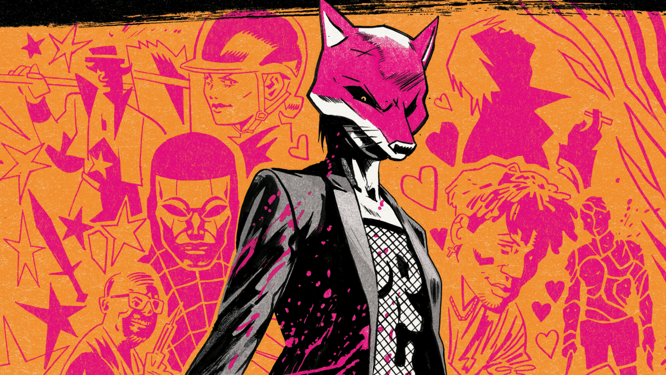
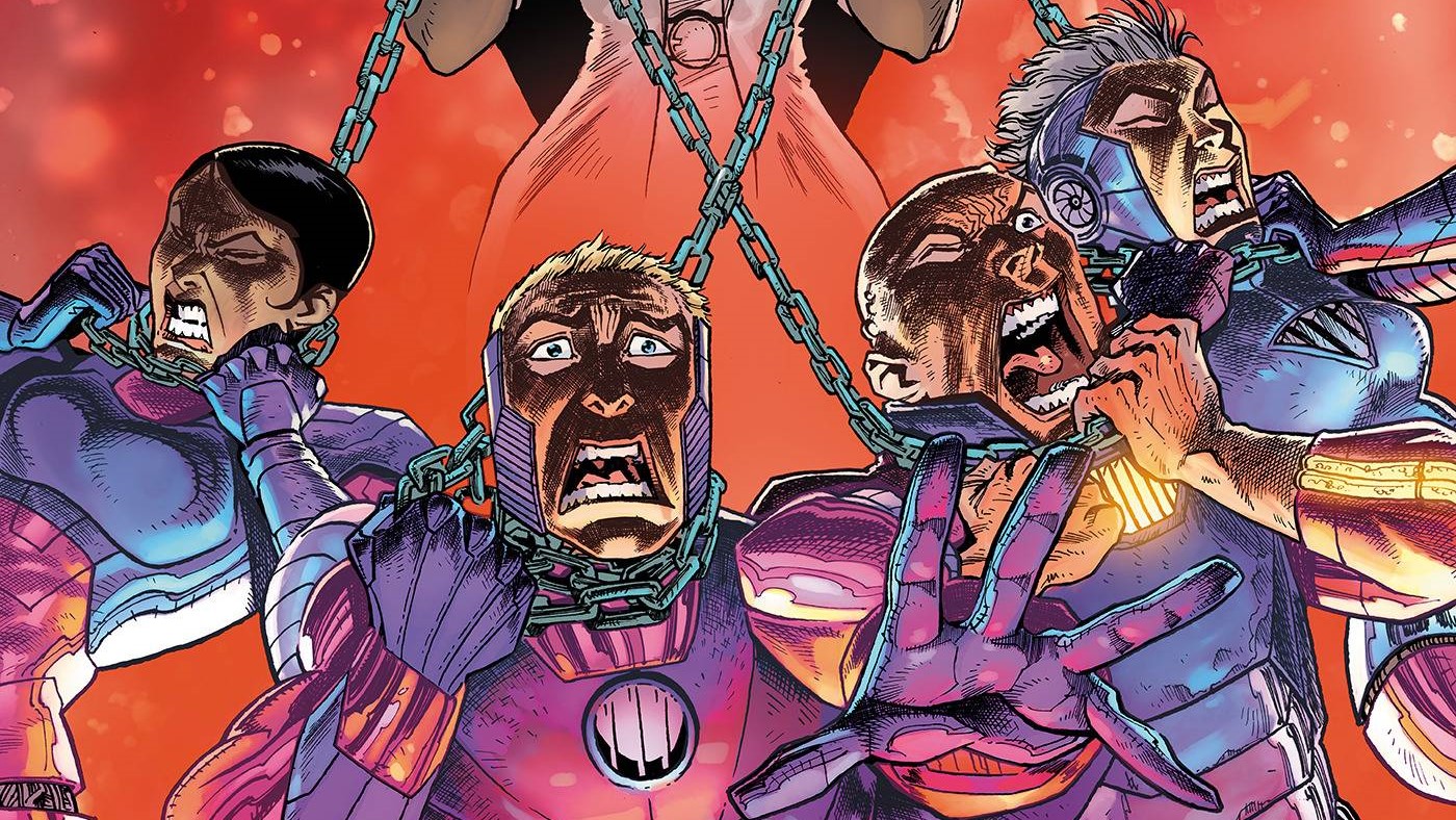
If you go after the queen of TV superheroes, you’d better not miss. Or you could think about sucking less as a person. Your choice, really, in Rogues’ Gallery #1, written by Hannah Rose May, with story by May and Declan Shalvey, drawn by Justin Mason, colored by Triona Farrell, lettered by Hassan Otsmane-Elhaou and published by Image.
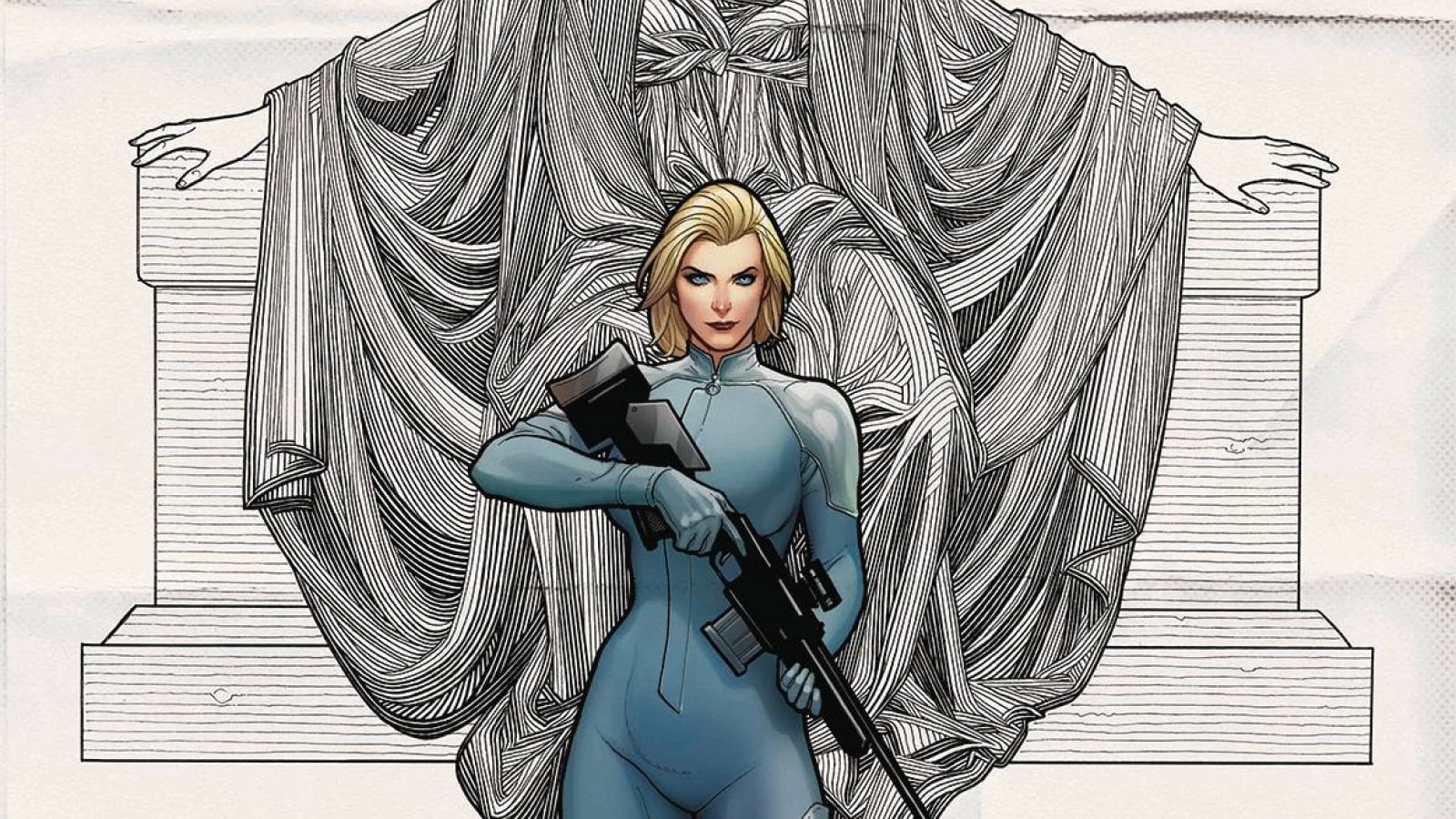
What’s a down-on-her-luck hitwoman arrested and sentenced to appear on a murder game show to do? Oh, yeah, that’s right: murder. Absolution #1 is written by Peter Milligan, drawn by Mike Deodato Jr., colored by Lee Loughridge, lettered by Steve Wands and published by AWA.
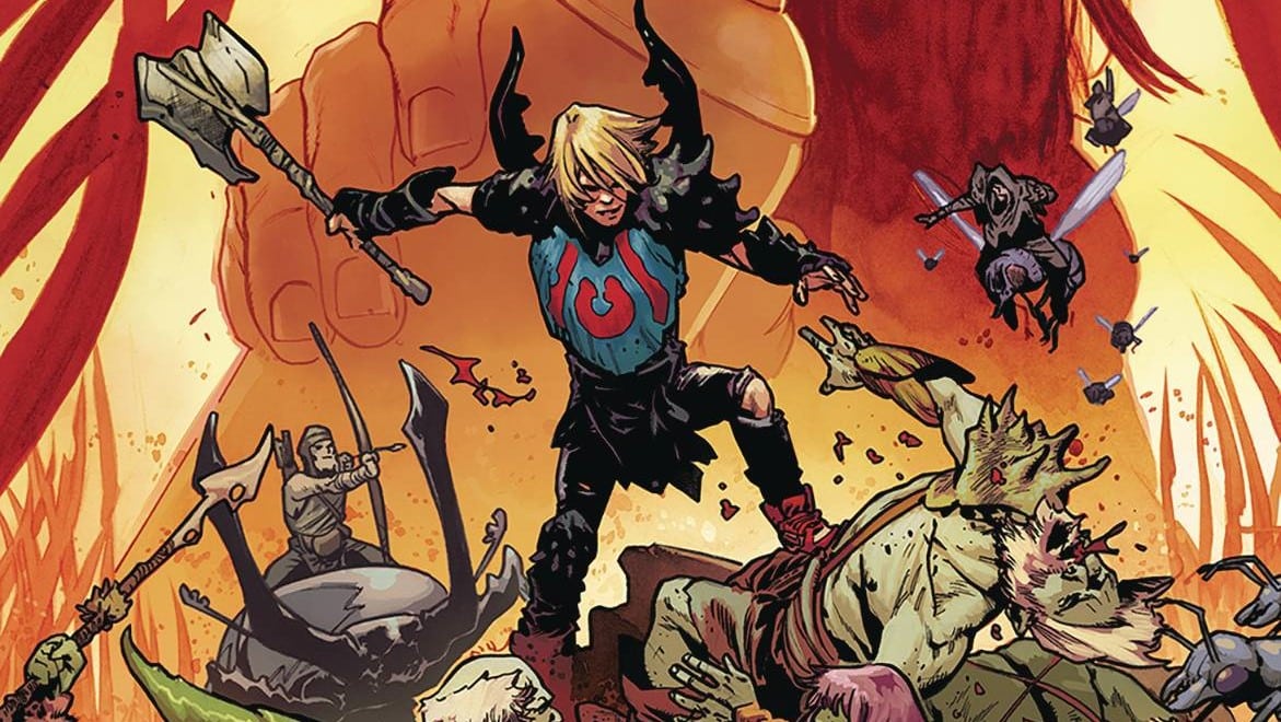
Dirt may not be able to get (and keep) a new girlfriend, but at least he’ll always have his imaginary talking bird and a deep, deep thirst for revenge in Above Snakes #2, written by Sean Lewis, drawn by Hayden Sherman, lettered by Hassan Otsmane-Elhaou and published by Image.
Will Nevin: Ian, I want to make something clear: I don’t pick books that I think are going to be bad. I really don’t. I might choose things that I figure are going to be weird or strange, but life is too short to read bad comics intentionally. Also, that’s just a shitty way to run a reviews column, especially one that focuses on indie books. Marvel and DC make sausage — some of it truly the sort that will saddle you with trichinosis — but they’re also cogs in billion-dollar IP machines. Who cares if we’re mean to them? But some of the books we read here might literally only sell in the hundreds of copies, made by creators working with their own properties trying to break into (and stay in) the industry. Creators, of course, who never set out to make a bad book.
That all said, Ian, I’m starting to doubt whether I can actually spot a good or interesting comic in the wild before I pick it up. This week made me feel like someone should take the keys away from me because your pep pep is getting too old to drive/pick comics for us to read.
Ian Gregory: I’m with you, Will. I have never set out to review a comic I know I will dislike, with the exception of Rob Liefeld comics, and that’s just because I’m a little brain poisoned when it comes to The Rob. That said, I have written lots of negative reviews since we started doing this column, and I’m going to blame it on you making the picks each week. Maybe I should thank you: You’re giving me an outlet for all my repressed negativity.
Will: You’re welcome. And Rob is terrible.
Rogues’ Gallery #1: Why Is Any of This?

Will: Let’s start with the thing that made me doubt whether I have the skills to do this, Rogues’ Gallery. The solicitation bills it as “The Purge meets Scream” (which seems like it would just be The Purge, but whatever!) but in practice, it’s more of a meditation on the shittiness of fans, particularly fans like us with opinions who like to spread their horseshit online. And look, I agree with the basic idea that fandoms suck, that we’re not entitled to some type of ownership in the intellectual properties we emotionally and financially buy into and that if you scratch a millimeter below the surface in most of these communities, you’ll find some of the vilest misogyny around.
But this sucked.
If we’re supposed to get into this series as some sort of revenge fantasy — a female celebrity dealing with the online tormentors who decide to take her on in meat space — why the hell is the entirety of the first issue from the perspective of the trolls? Why is the dialogue, full of screeds on “wokeness” and “white knights,” so stilted? Why does this 23-page issue feel like 40?
Ian: I’m so glad you called out the length of this issue. At one point I stopped and thought, OK, this is like a double-length first issue, and when I checked the page count I was on Page 18. There are a lot of baffling choices being made in this issue. First, of course, is that the solicit seems completely detached from the content of the book. That’s not really an issue, because most people reading comics will never read a solicit in their life, but it definitely took me by surprise. The second major issue is that this entire first issue is essentially setting up the real main character, as far as I can tell. The end of this issue feels like something of a shut-down of the first 21 pages. Sure, we don’t like the misogynist internet trolls, but we’ve just spent 20 pages getting in their heads, seeing the point-of-view character’s complex life, and following along on their plan for an ill-advised heist. I’m not really sure what we’re supposed to get out of the end of this story.
Will: You lit Golden Rage on fire last time by saying it was hiding from its premise, and while I don’t know if we have that here, this certainly takes forever in setting itself up. And I think another core problem here is that none of this seems particularly believable or relatable — the shitty dad character is straight out of your nearest box of cliches (right down to the “go buy me beer!” strain of alcoholism), and it’s hard to get invested in a faux Batman character when we don’t know or care anything about the Red Rogue universe. Also, a 10-year run is more than enough for any superhero television show. There’s no way it would be hitting some crucial moment or inflection point that deep in.
Ian: It’s a natural reaction to the mainstreaming of Marvel properties, and the growth of online fandom, to want to make comics about superheroes and comics as an industry. Chip Zdarksy is doing it in Public Domain. I think Rogues’ Gallery has some pretty good ideas, particularly in highlighting the ways that toxic communities will oftentimes pick a prominent woman involved in a show and scapegoat her for everything that happens. But instead of actually reflecting on those interesting ideas, we dive straight into cliches and violence.
Will: We didn’t even get the violence in this issue, but I guess it’s coming. There was an effort made here? They tried? Maybe the second issue is better? I’m struggling to say something nice here, Ian.
Ian: I didn’t hate this issue, but it definitely didn’t do that much for me. That said, I liked Justin Mason’s art and Triona Farrell’s colors. I also think there are some opportunities in the second issue to build on the more interesting ideas of the first. There’s also lots of room to go off in some bizarre revenge fantasy direction that I think would be much less interesting, but just because the ending of this issue was so abrupt, I do want to check out the second.
Absolution #1: Televised Murder Sport Should Be Less Complicated

Will: While not as dishwater dull as Rogues’ Gallery, I wasn’t a huge fan of this book either. Let’s start with the core dystopian idea: A contract killer is caught, and rather than being put to death, she’s made to continue her job for the sport of it as millions ride along via cameras and ESPN-style presentation and commentary. It’s interesting, but thematically, I don’t think it’s that much different than The Running Man, which will always be better because it had Richard Dawson.
This is too messy with too many ideas that are undercooked (always a chief concern here in Leftovers). Nina’s got these cerebral lesions, so her desire to kill or ability to be a killer is not her fault? But if she kills enough and impresses fans, her crimes are forgiven … but also there’s a bomb in her head? And she was already famous before she got on the murder show? I don’t know why the last three sentences were questions, but this feels too complicated by half.
Ian: You’re right that there’s a lot happening here. I think the brain lesion stuff is a bunch of malarkey — as in, the government made it up to justify something or other happening in the plot. Other than that, things are definitely overcrowded: Nina was some master hitwoman, with 200 kills to her name, which is already an absurd premise. Then, she gets some robot parts and a bomb in her and has to compete on the show to earn her freedom. This is, quite literally, the plot of Gamer, the 2009 movie in which death row convicts fight to secure their freedom on television. That’s not exactly a great movie, and the premise isn’t doing much better here.
Will: AWA continues to not employ me as legal counsel, but if they did — and this has come up before — I’d tell them that their artists have to stop using likenesses (famous or otherwise) for their books. Deodato, who decided to be weird online for no reason this week, clearly used references of Woody Harrelson and Kobe Bryant for some of the characters here, and while you said last time you don’t see this stuff, I wanted to point out again they should cut this out lest they get sued to bejesus and back. You have any art notes?
Ian: I’ve said this before, but Deodato just doesn’t do it for me. Part of it is the overly realistic faces, as you say, but another part is just the washed-out photorealistic scenery. I do like what he’s doing with layouts, and the constant repetition of the grid pattern is a nice touch — Nina is constrained by the actual layout, in a way. Sometimes he maybe overdoes it, but at least it gave this book a visual identity.
Will: I thought the action was good here. Fluid. Fun. But the damned thing is just overwritten as hell.
Ian: The vast majority of comics we review fall into one of two traps: They have too little premise, or too much. It sounds obvious, I know, but it’s extremely hard to find the balance between “conceptually interesting enough to interest you in the second issue” and “leaving space to actually introduce characters who can stand on their own.”
Above Snakes #2: So Much Technicolor Killin’

Will: Ian, I’m simply not ready to talk about the variant cover to #3 other than to say it exists, and it makes me want to go all Sam-Neill-in-Event–Horizon on my eyes. But at least it’s part of my Personal Brand(™) since at least two people in the ComicsXF office sent it to me. Gotta love these co-workers of ours. [Grote’s note: I was one of them!] Putting aside my personal pain and torment to focus exclusively on #2, the lettering is still the only thing I don’t like here with, as I said last time, even the standard letter art not doing it for me tonally — and that’s not even taking up all the try-hard stuff. I promise this is the last time I’m going to talk about the lettering in this book, because it’s not going to change, and I’m going to hate it for as long as Dirt is out here killin’.
Ian: Otsmane-Elhaou also lettered Rogues’ Gallery this week, but that issue has much more conventional lettering. The only exception is the TV-show scenes, where the outsized character logos in the word balloons nicely fit the campy feel of the series. I don’t mind the lettering in this series as much as you, but I do agree that it’s a little too flashy for my tastes.
Will: Sherman, though? Killin’ everything just as dead as Dirt. This book is so vibrant and full of energy, and their colors have so much to do with that. (More than the irregular balloons that look like dying spermies. Wait. I said I was going to stop complaining about the lettering, didn’t I? It wasn’t a complaint. It was a compliment! I think dying spunk is a great aesthetic choice. Really helps the narrative tone.)
Ian: I’ve never seen a neon-colored Western before, but it really works here. The art is absolutely fantastic, and I especially love the page of Annie trying to bring herself to fire her gun. Another stand-out to me is the bar of hooligans celebrating as Dirt accepts a date from Annie. This is a pretty heavy issue, so those brief moments of comedy are even more important to balance the tone. I would argue that the Western is one of the most vibe-heavy genres, and Above Snakes has nailed this very particular sardonic, melancholic tone.
Will: Lastly, the story. I still prefer my revenge tales a bit more grounded, but Dirt as a lovable, half-crazed Ol’ West murder machine with exactly one purpose in life (killin’) is a fine story. Do you think he finds happiness? Or is there just a bunch of corpses in his future?
Ian: We’ve all read stories where a character seeks revenge only to learn that revenge won’t make them happy. I think Dirt already knows that revenge won’t make him happy, and he’s consigned himself to misery to make the lives of other people better. Maybe what Dirt needs is someone to do his revenging for him, or maybe he needs to get rid of that darn haunted bird. This is one series that could go a lot of different ways, and I’m definitely looking forward to future issues.
Does This Smell OK?
- Sound Effects Watch: In Above Snakes, when Annie tackles that guy, the “Wham-thump” is separated by their bodies hitting the ground, making it clear that the “wham” is the first action, the tackle, and the “thump” is them hitting the ground. Clever!
- Rapid fire questions:
- What’s the fake IP you’d use in your comic if you couldn’t get a license?
- Will: I’d probably cobble together some version of Punisher+Batman and do a ripoff of Irredeemable. (Which we need to get back to at some indefinite point in the future.)
- Ian: I could definitely conceive of some sort of Z-Men involving dozens of increasingly bizarre characters, inexplicably beloved by millions of people.
- Best dystopian film?
- Will: Robocop. I’d buy that for a dollar! Also, fuck Ronald Regan.
- Ian: The Matrix. I like punchin’, and I like shootin’.
- Will: I increasingly agree with the idea that 1999 was the pinnacle of American civilization because the internet was both 1) available and 2) hadn’t made everyone stupid yet.
- Is there more to life than killin’?
- Will: In a revenge story? Absolutely not.
- Ian: Not ’round these parts, pardner.
- This list of 15 unsafe leftovers seems suspect, especially for its inclusion of french fries. Who’s eating leftover french fries?
- Turning leftover food into gas doesn’t have to be a complicated process. </fart joke>
- If savages are willing to turn grits sweet, I’m ready to hit them back by frying oatmeal and making it savory.
- If you’re not eating your leftover pizza cold, maybe reheating in the skillet is the second-best option.
- What’s the fake IP you’d use in your comic if you couldn’t get a license?

