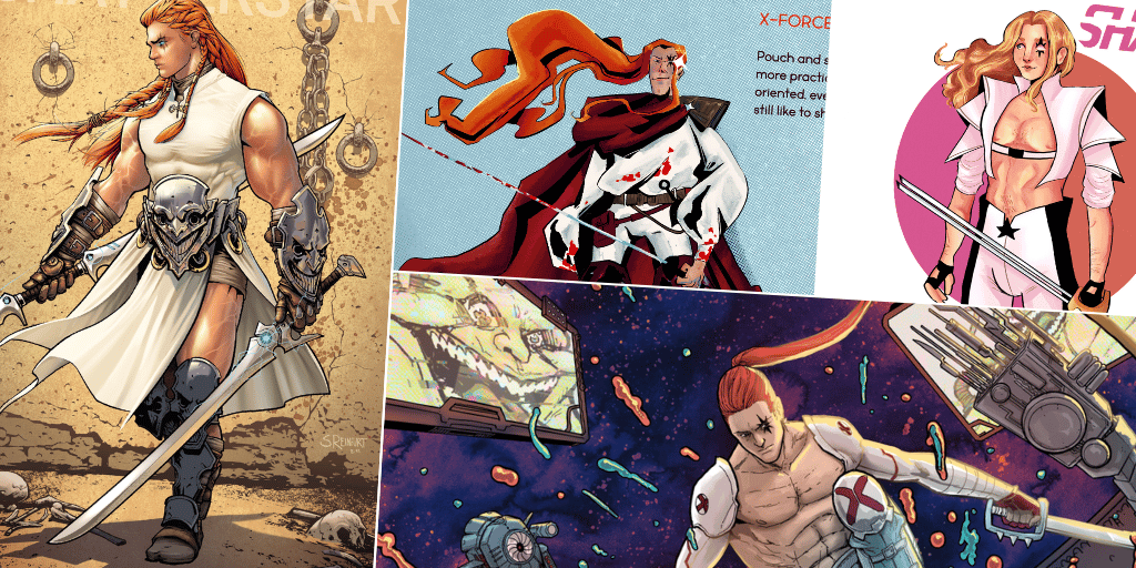
I’ve gotta be honest – I objected to this round. One, it was the first time our Redesigning crew had voted to elect a male character as our subject and Two, I frankly don’t know how to summarize such a specifically esoteric character like Shatterstar. Created by Rob Liefield and Fabian Nicieza, Shatterstar has had a consistent presence in X-Men comics since his debut in 1991, and yet you’d be hard pressed to find too many fans who can relay his complicated backstory with much clarity. Shatterstar might be a tube-grown gladiator with hollow bones from the media-obsessed Mojoverse, whose father is also his son, but he’s also a queer mutant with a fiercely loyal fanbase and a history of heroically joining the X-Family in some of their greatest eras.
Whether Gaveedra-Seven aka Shatterstar is your long-time fave or you have yet to wrap your head around the concept of hollow bones, the designs our artists have cooked up will have you seeing this character as a favorite like never before. Check out the work of our amazing crew of artists and follow their work on social media!
Léa Dupic

Shatterstar is one of my favorite marvel characters so I was thrilled to redesign him! I mixed in elements from matador, fencing and gladiator outfits to create a look for his mojoverse fighting era, and one for his x-force team era. I love Mignola’s one drawing of him, so I wanted to incorporate heavy shadows and a flowy silhouette to his x-force look. And I love the idea that he wears white so blood splatters can be seen by all his fans. Oh, and thigh high boots. I really like thigh high boots.
Andrew Drilon

My redesign was inspired by Roman gladiators, going back to Shatterstar’s roots as an arena warrior on Mojoworld. I threw in a dash of Adam Pollina-era X-force plus a little bit of Final Fantasy for good measure. I also took notes from David Baldeon’s recent X-factor design (more of a social-media-friendly wrestling look), keeping that color scheme intact. I think Shatterstar should always look supercool and dangerous, to play against the inherent nobility and sweetness of the character. And those double-swords, while impractical, are just too awesome-looking to leave out.
Joshua Bruckner

I wanted to take Shatterstar away from the x-treme 90s look he’s best known for and went for something more overtly queer and less masculine. I also gave him some colors besides white and black. He still looks like a gladiator and warrior, but more willowy and lithe and ready to hit the clubs on Krakoa afterwards.
Hector Barros

My mental pinterest board for ShatterStar was “Billy from Stranger Things, dressed ready for American Gladiator, with some references to Longshot and Dazzler”
Karen Charm

The new Street Fighter designs leaked when I started thinking about this, so that was the direction I headed at first. Then I started thinking about fencing outfits and was trying to factor that into the whole thing. I wasn’t totally satisfied and then I thought “oh, he’s a weird alien” so I just wanted to go as impractical as possible. I like having him be totally unrecognizable but still have a few classic elements and colors incorporated (I love the purple suit 90s era, for instance).
Alex Buckland

I didn’t know much about Shatterstar before this so this design is based purely on vibes! I like his pro-wrestler look from his X-Factor (2020) appearances so I wanted to combine that with his past aesthetics.
Kenneth Laster

No thoughts. Only abs, shoulders, and cape.
John Caden

I think we can all agree that Shatterstar should always be shirtless, sexy, and always ready to tussle (if you know what I mean). I’m a sucker for teleporters so I wanted to focus on that side of him too.
Calvin Lin

For Shatterstar I tried to mix up the modern look and the classic look! And also with a nod to Lewis Tan’s version from Deadpool 2!
Johnny

Did y’all know Dazzler’s original design was a black woman? As someone who’s half black, drawing mixed Star is so cathartic and good. It’s almost canon! I gave him a sporty look while trying to maintain that flashy style you can only find in Mojoverse!
Jarrod Chilton

For this design I was inspired by the 90’s era of comics. It’s got pouches, overly complicated ornamentation, and oh so much crosshatching. Would I be able to meet my editors’ deadlines for a monthly recurring this way? Never! That’s what guest pencillers are for.
Mariel Rodriguez

I was a big fan of the wrestling inspired look in X-Factor (2020) but I’m also a huge fan of the jackets circa X-Factor Investigations because it was my first exposure to Shatterstar so I kind of just ended up smushing those two concepts together. I also gave him anime hair because I think a Mojo warrior with hollow bones deserves a certain degree of unreal floaty aesthetic. Also Lewis Tan made Shatterstar Asian to me.. and I thought a lot about Rurouni Kenshin…
Rudy Trevizo

I took inspiration from Shatterstar’s gladiator roots and a couple outfits I found on Instagram. I also made Star half black based on Johnny’s take on Dazzler and Shatterstar. And because it’s Shatterstar I had to give him a tits out moment. No gladiator himbo is complete without one.
Erik Ojo

Mojoverse Gladiator Shatterstar! a redesign inspired by….an extremely eclectic but very mojoverse collection of concepts – nascar drivers, straitjackets, and bondage
Stephen Reinfurt

For this Shatterstar concept, I really wanted to play up the “gladiator” side of his character. I gave him medieval armor with Mojo’s likeness incorporated into the designs. His hair takes inspiration from Viking warriors, with more intricate and different size braids that have partially come apart for a wilder look. The simple white tunic is an updated fighting-monk-style version of the original white costume. And finally, I made his weapons look less like ninja swords and tried designs that felt more alien and futuristic.
Adam Reck

My Shatterstar redesign is a spin on the Greg Capullo version in Shattershot. Going for a royal but yet understated and battle-ready look for the King of Mojoverse. Double blades are always a must, so why not have three?

