Last weekend, we learned of the passing of comics great Sam Kieth. At only 63, Kieth died far too young from Lewy body dementia. There has been an outpouring of condolences and thoughtful remembrances describing Kieth’s unique vision, his creativity and what an odd talent he was. Since others have highlighted their personal relationships with him or focused on the stages of his career, I wanted to focus on the thing that drew us all to Kieth in the first place: His inimitable and wholly original art.
The wildest Wolverine

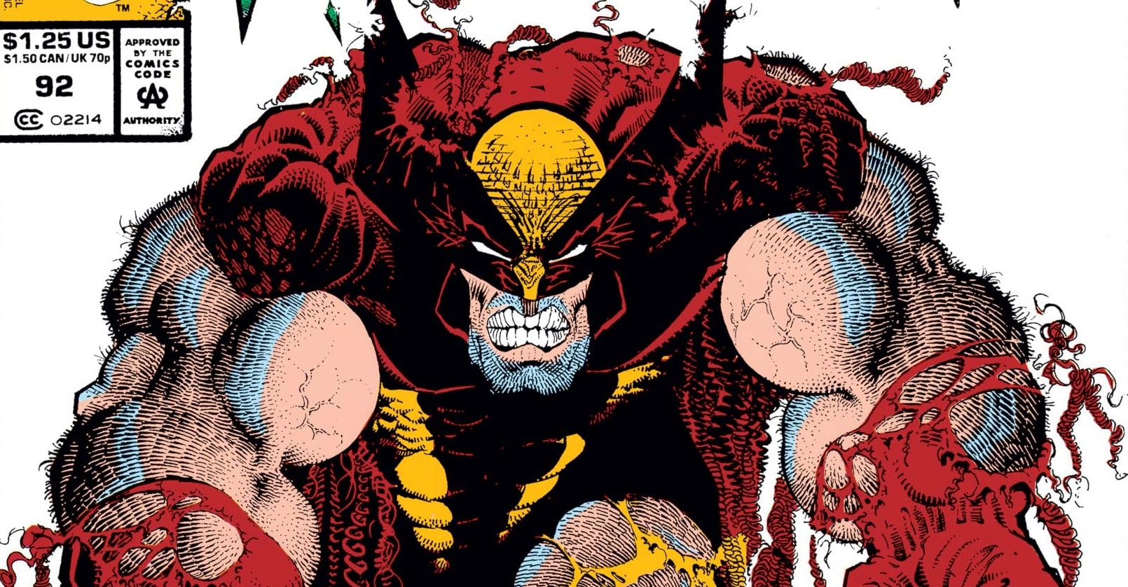
The first time Kieth’s work crossed my path was in the pages of Marvel Comics Presents. It was here I encountered a version of Wolverine I’d never seen before, that was at once recognizable and yet seemingly delivered from a parallel dimension. The Wolverine I’d grown up with in the ’80s was John Byrne’s, Paul Smith’s, Marc Silvestri’s, John Buscema’s and most recently Jim Lee’s, none of whom was able to capture Logan as bestially as Kieth did. His depictions of Wolverine were lumpy, as if the canuck had been built from chunks of balled clay and rolled on the floor of a barbershop. Wolverine was often depicted on logs, cliffs and in nature, shirtless and hairy. When Kieth did draw Wolverine in costume, the anatomy remained as inflated, but the mask was more wiry, like ripped flags standing full mast on either side of his head, eclipsed by his bulky muscles. Other notable MCP depictions included a Ghost Rider who wore his flames around his skull like a bouncy chain of hair, topping off wide, structured shoulders, spikes and at times gangly naked bones. Kieth’s Venom had similar proportions to his Wolverine, but even bulkier, emphasizing Eddie’s sinister toothy grin and jagged eyes.

The pages from his most notable MCP story, Blood Hungry (written by the late Peter David), are filled with complex compositions of art nouveau framing curling around reflective mirrors and spiky blades of grass. Kieth weaves seamlessly from casual bedroom conversations to slashing fights with the new villain Cyber to a trippy hallucinatory sequence involving a classic car. Everything is exaggerated, from the brim of Cyber’s wide hat to the sumptuous curves of Tyger Tiger. The latter is incredibly important to Sam’s style. While his giant men are masses of round muscle, his women are often hourglasses with wide hips, round heads and flowing tresses.

While Marvel Comics Presents was home to some previous experimentation, artists like Barry Windsor-Smith or Rick Leonardi had already established themselves in the pages of Marvel comics. Kieth was coming from the world of indie comics. His biggest previous works were the first five issues of Sandman and a (gorgeous) Dark Horse Aliens mini. Kieth was not forced to adopt a “house style” for Blood Hungry, and it’s hard to even imagine him trying.
He also stood out from the sharper styles of upcoming Marvel superstars. While Lee, Rob Liefeld and Whilce Portacio (and inker Scott Williams) often relied on a flurry of crosshatching to render their characters, Kieth’s arcing backs and at times Looney Tunes-esque cartoons were closer to Todd McFarlane’s. But where McFarlane relied on large wide eyes and ballooning cheeks, Kieth’s style pinched features into slitted eyes and frowns carved into the skin of a potato. In retrospect, Kieth’s MCP work provided much of the stylistic template for what was coming next, a project that made him a true contemporary of the most popular comics artists of his generation and yet still proved his unmatched capacity for originality.
Into the Outback

Let’s just dissect the design of The Maxx for a moment. First off, The Maxx has in large part the same contours as Kieth’s Wolverine. He is a lumbering, hunched, upside-down “U” with a low-hanging head, balled fists and giant claws. But The Maxx was a long-gestating design for Kieth, one that stretched back to early work reprinted in Fantagraphics’ I Before E compilation and explains The Maxx’s central lapine feature: Instead of a mouth per se, The Maxx’s jaw is simply a row of large, jutting teeth. These chompers are oddly expressive, forming a deep frown on the cover of The Maxx #1 or a curved hoof inside. The rest of the character is a rich purple save for a yellow stripe along the nose and forehead (or where a nose should be), yellow “gloves” that look like The Maxx’s pointy mitts were dipped and splattered in paint, and giant triangular brown boots. The Maxx also has a second look when he visits the spiritual land known as The Outback that adds ear-like feathers and a lionesque mane.

The Maxx’s core characters each have their own quintessentially Kieth-ian silhouettes. Julie is a shapely hourglass with bell bottoms, Mr. Gone is a barely veiled phallic symbol of sexual violence, and the Isz possess the sharp teeth of Kieth’s Venom set into murderous anthropomorphic M&Ms in interdimensional black and white.
Along The Maxx’s 35 issue run, Kieth and his writing partner William Messner-Loebs would expand the cast and explore their various psychological demons, with Kieth illustrating a wide variety of urban, jungle and intertwined environments. And while there were times when The Maxx fought giant monsters on the prairie, much of the time the intersecting stories and mysteries of the leads propelled the narrative and the visuals (either literally or symbolically) through a blend of beautiful paintings, crude scrawls and mixed media.

Kieth’s ingenuity extended to his page layouts, which were often not just typical grids of rectangles but included arcs, ovals, semicircles, panels radiating out in a fan from off page or images bursting from their surroundings framed in expressionist slashes or twigs and branches. The combination of changing imagery and the flips between realities disorients the reader. Is that a mask or a lampshade? Is that a mountain or a mailbox? What exactly was going on in The Maxx is revealed gradually over the run as much through symbolism and visual clues as anything in the dialogue.

It’s wonderful that Kieth’s work was already being reconsidered during his lifetime. IDW certainly recognized Kieth’s talents enough to revisit The Maxx in The Maxx: Maxximized, which reprinted the original series with new colors by Ronda Pattison and was collected into handsome hardcover compilations. If you’re lucky enough to own IDW’s Sam Kieth’s The Maxx Artist Edition, you can see scans of Kieth’s black and white original artwork for the first six issues in its original dimensions. Not every artist gets this kind of recognition until much later in life or even after they are gone.
A novel inspiration

In the early ’90s, it seemed like every comics artist under the sun wanted to be Jim Lee. The result was years of homogenized attempts at capturing and replicating a style and an energy that at best could be considered a pale imitation. Despite the multi-market success of The Maxx (Many fans of the comic book first discovered it via the MTV cartoon. Maybe you’re one of the lucky owners of The Maxx Maxximum Sound read-along cassette!), Kieth was never the artist everyone else wanted to be.

There’s an uncanny quality to The Maxx because only Kieth can properly capture his creation on the page/canvas. It’s been fascinating seeing artists memorialize Kieth in the past week by drawing The Maxx. Despite any of their individual talents, they all look slightly … wrong. (I think the closest anyone got that I saw was Jim Mahfood.) This was just as true in 1996 when the Wildstorm/Image The Maxx trading cards were released. Despite the amazing talents of the 80 artists depicting The Maxx and his extended cast, not a single one looks exactly right. There is something almost supernatural about Kieth’s ability to depict his creation in a million warped ways in pencil, pen and paint and creators to this day not being able to quite nail it.

In a very sweet tribute on Instagram, Skottie Young sung the praises of Kieth, saying a pair of Maxx posters in his bedroom “influences more of how I draw than any other full graphic novel or library… I stared at it daily. You’ll find THAT grass in almost every panel and cover I’ve needed to draw grass.”
And yet, while you can see the influence of Kieth’s work in Young’s oval-headed characters and their twisted grins, Young’s work is still very much his own with diverse influences from Keith Giffen to Bill Watterson. There are precious few if any comics artists working today who are going out of their way to make their stuff look like Kieth’s.
And this is the thing that separates a visionary from his peers. Instead of everyone wanting to be Sam Kieth, Kieth inspired artists to be as unique as he was, explore their own style and become something wholly new.

Adam Reck is the cartoonist behind Bish & Jubez as well as the co-host of Battle Of The Atom. Follow him @adamreck.bsky.social.