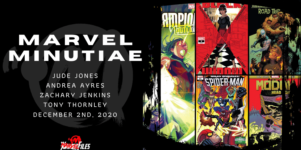
Hello friends and readers! It’s a chunky week as Jude Jones does double duty with Miles Morales: Spider-Man #21 and Champions #3, Andrea Ayres graces us with her opinions on Black Widow #4, Tony Thornley hits the road with Fantastic Four: Road Trip #1, and our boss Zachary Jenkins loses his head with M.O.D.O.K.: Head Games #1!
Miles Morales: Spider-Man #21
Written by: Saladin Ahmed
Pencils by: Marcelo Ferreira
Inks by: Wayne Faucher
Colors by: David Curiel
Letters by: Cory Petit
The hardest part of reviewing a work of art, be it a graphic novel, a mural, or a musical, is to judge the art on what it is, not what we want it to be. To remove our biases from the equation – as much as possible or, depending on the art, as little as necessary.
This is uniquely hard with comics. We fans are a ravenously opinionated bunch, spoiled by memories of the best of our art, and thus super critical (oftentimes unfairly so) of any art that doesn’t meet that arbitrary, moving standard.
This is harder still when the character you’re trying to judge objectively was created, in no small part, to be subjectively in tune with you. With your culture. Your look. Your hopes and dreams.
So how does one manage such subjectivity, objectively?
I have no idea, but I think it’s important to know what I’m trying to sort out as I note my disappointment with not just this issue of Miles Morales, but the entire series as constructed.
Issue #21 is a non-stop crechendo of action, the final act in the plan of Ultimatum, aka the “real” Miles Morales to claim the world for himself. Mind controlled villains fight a hastily assembled super hero team, led by Captain America and Miles’ former SHIELD agent father.
Pow. Bang. Fwoosh. Etc.
Uncle Aaron, aka the Anti-Hero Prowler, ends up sacrificing himself (or did he?) to send “Ultimatum Miles” to another universe. Problem solved. On to the next issue.
This is all fine enough. The plot is advanced and a new arch can begin. And maybe as a 38 year old I shouldn’t ask for a comic to be more than fine enough. Maybe quick flowing action and simple to understand beats are really a sign of genius: after all, with new people discovering Miles Morales from the movie and the video game, maybe it’s best things are kept simple, so new fans can jump on without being overburdened.
Maybe all of this is fine.
But.
I’ve worked with kids most of my professional life, and it’s always been my passion, my desire, my *need* to push them forward. To challenge them. To make them question their surroundings. The educator in me wants there to be more so the kids who pick up this issue can grasp more. Think more. Question more. And boy is there a lot to question:
Is Alt Miles Morales too one note? What does the prospect of the 1610 universe (the “Ultimate” universe destroyed during Secret Wars) mean? What are Prowler’s internal motivations? Does Miles talk like any teenager you know?
But there are frustratingly few answers given; Just characters acting as slaves to prescribed plot points.
And maybe that’s fine. Maybe it’s what it needs to be. It’s a breezy read. I’m just eternally disappointed it’s not what *I* want it to be.
But that’s my issue. Not yours. Pick up the issue and judge for yourself.
Black Widow #4
Written by: Kelly Thompson
Art by: Elena Casagrande, Carlos Gómez
Colors by: Jordie Bellaire, Fredrico Blee
Letters by: Cory Petit
I have tried very hard to army crawl my way through the stand alone Black Widow series but no more. Issue #4 sees Black Widow begin to wake up inside Natasha, building on the slow reveal from previous issues. Who is to blame for her fall (literally and figuratively)? Turns out, it’s nigh everyone! Alas, the more things change…
The reader is supposed to care more now because she is a MOTHER with a CHILD and a HUSBAND who love her. More than that, we are supposed to care because we see that Nat is actually capable of expressing sincere emotions like love, angst, sadness. Sadly, her relationships are mere vectors for the reader to see Nat has feelings beyond snark from decades of numbing out, avoidance. By giving Nat the amnesiac-mother storyline we’re able to fetishize her for the woman she might be, if things were different. If she had a different life, made different choices. Of course readers don’t want Nat to be happy. In fact, she can’t be.
If Black Widow experienced sustained happiness she would cease being, well, Black Widow. This storyline has allowed writer Kelly Thompson to exercise some emotional variation for Nat without the stress of having any of it be permanent because it can’t be. From the moment this storyline began we knew the kid, the husband, the marriage, weren’t real. Despite the issue’s insistence otherwise, they were props. I’ve seen a variation of this story so often that Thompson’s version of the amnesiac-mother washes over me like a tepid bath of skim milk. It’s not that I think every story has to be original, that’s impossible, but I at least expect it to be interesting.
Issue #4 has the added awkwardness of a flashback sequence done with a different art and colorist team. Carlos Gómez on art ends up annihilating Elena Casagrande’s style. Their styles are so different I began to question if it was the point. Gómez invokes the Nat we knew and Casagrande reminds us of the Nat we know. Even if that is the case, it doesn’t work. It could be because the pairing of Thompson and Casagrande has felt off from the start. Thompson wants to tell a dynamic, action driven story and Casafrande’s style just doesn’t allow for that. The obviousness of which becomes blatantly evident to the point of jarring in the flashback sequence.
Jordie Bellaire continues to provide the colors for present day nat with Fredrico Blee on colors for the flashback. Letterer Cory Petit provides VCs for both present and past. I’m not interested in comparing art or color styles for the sequence, just to say the work of Blee and Gómez feel like more of a home for the story Thompson is telling.
Issue #4 follows course for the stand alone Black Widow series in that it continues to be a disappointment.
Champions #3
Written by: Eve Ewing
Art by: Bob Quinn
Colors by: Federico Blee
Letters by: Clayton Cowles
10 Reasons Why Champions #3 is worth your time:
- Dr. Eve Ewing assumes you have a brain. Whereas some comics aimed at younger readers mistake threadbare plots and simple words as necessary evils, Dr. Ewing assumes the opposite: that young readers have the capability *and desire* to figure it out. The Champions #3 weaves three separate plot lines together, all connected by questions of morality and action. It’s not so much that the presentation is complex; the plots are siloed, so a read can fully digest one beat before embracing another. But there is enough heft in each movement to give a young reader something to think about. There are no easy or clear answers given.
- Revolution is not romanticized. Whereas some comics (and some governments) would have you think doing the right thing is self-evident and always leads to adulation, Champions is directly subverting that trope. That the “heroes” are hunted, jailed, and forced to recon with potential traitors in their midst. Art does imitate life, apparently, and I applauded Dr. Ewing for gently introducing that uncertainty into a dialogue aimed at younger readers.
- Strong women, everywhere. Every beat in this issue is lead by a woman: Every decision, every action, every choice is woman led, from the CRADLE-house insurrection to Viv Vision’s desire to learn to click her heels and go to Kansas (literally). This is done without pretense; without framing women leading as some anomaly that needs to be highlighted. It’s just there, and it’s beautiful in its banality.
- Scott effing Summers. Coming off last week’s X-Men #15, Cyclops is on a tear, re-emerging as a *positive* force. His cameo appearance here continues that streak. Long live Red.
- This corner of the Marvel Universe feels lived-in. I’ve seen too many buildings toppled too many times over the past year in the Marvel Universe, from War of the Realms to Empyre to King in Black. It’s all so grandiose that it feels disconnected from any kind of reality. However the world in the Champions feels lived in and tactile, which makes the questions raised all the more tangible. I wouldn’t believe anyone would care about kid heroes in a world that’s essentially been destroyed every six months; here, however, I can.
- The kids feel like kids (mostly). Too often people writing for kids try too hard to make the kids sound cool: infusing “hip” words, or making the characters overly sassy or sarcastic. Dr. Ewing allows the kids to be kids, and kids, if nothing else, are passionate. Do they pontificate a bit too much sometimes in service of exposition? Yes, they do, specifically Ms. Marvel here. But even there it feels earned and honest, and that’s all we can ask for.
- The art is good. It’s bright. It’s easy to identify action. It’s well drawn and well curated. It makes the action seem very “well produced Saturday-morning cartoon-ish” which, well, kinda ages me since Saturday morning cartoons are no longer a thing. But! The kids will be alright, regardless.
- No preaching.
- No adult saviors.
- No “very special moments.” I don’t believe kids need to be talked down to. I don’t believe they need to be led or pushed by adults. I don’t believe in magical epiphanies that change everything in an instant. The best way to lead kids is to let them chart their own path, no matter how messy or unclear it may be. We are here to support; they must do the work. They must do the learning. They must become their own heroes. It is a long, dirty process. It is worth it. And insomuch as the comic shows the Champions crew learning that on their own, the readers are encouraged to do the same.
Highly recommend.
Fantastic Four: Roadtrip #1
Written by: Christopher Cantwell
Line Art by: Filipe Andrade
Colors by: Chris O’Halloran
Letters by: Joe Caramagna
I haven’t ever been a religious Fantastic Four reader, but it’s a title I’ve kept up with quite a bit for years. After reading this I just have to say- why hasn’t Fantastic Four body horror ever been more of a thing?! (Pardon the pun.)
I mean, I know there’s a lot of body horror baked into F4 stories, and many stories have flirted with it. But this is the first time that I can think of that just straight up tells a horror story with the Four and their powers. Cantwell bases the horror in the characters though. He takes his time getting us comfortable with the characters (who he writes really well) before he turns on the terror.
Where the writing sets up the conflict and terror, the art really brings it home. Andrade draws some really gross F4, such as Ben sloughing off his rocky skin or Reed literally melting, and he makes sure it gets worse and worse as it goes on. His depiction of the villain- the way underused Mad Thinker- is done well too, with a gleeful, manic energy. O’Halloran does a really great job too, setting the entire story during the day, so we can see every disgusting, horrifying moment.
It’s not without its problems. The format really makes the story suffer. It’s only a few pages longer than a typical single issue, and it shows. The horror ramps up quickly, and the conclusion feels a bit rushed. That also means that several characters get little to no page time- including Johnny, Alicia and a park ranger or county sheriff who suddenly shows up with Johnny. If this had been at least double length or a full arc/limited series, it would have fared way better.
However, in the end it comes down to one thing that the entire creative team sells perfectly.
The Fantastic Four are really pretty freakin’ gross, yo.
M.O.D.O.K.: Head Games #1
Written by: Jordan Blum & Patton Oswalt
Pencils by: Scott Hepburn
Colors by: Carlos Lopez
Letters by: Travis Lanham
Comics are in a place weird y’all. Take M.O.D.O.K.: Head Games, for instance. This is a book that’s not really, but still sorta tied to an as of yet unreleased stop motion, adult animation show. It’s a media tie-in that exists as the last vestaige of an aborted Hulu attempt to deliver their own answer to cinema’s The Avengers or Netflix’s The Defenders.
It was going to be called The Offenders. Howard The Duck was their big selling point. No matter the fact that actual comedy names like Kevin Smith and Chelsea Handler were involved, it was going to be an uphill battle for succss. So it’s weird that, after all that planning, the only thing we have gotten from that entire effort is this comic. Weirder still? It’s exactly what a M.O.D.O.K. book should be.
The mental organism designed only for killing is having a rough time. He’s getting flashes, memories of a life he never lived. On top of that existential crisis, his co-workers are staging a violent coup and forcing his retirement. What’s an oversized head in a floating chair to do?
Frankly, M.O.D.O.K. is an easy character to write poorly. He’s a ridiculus design with a personality that can slot right into generic mad scientist. Writers Blum and Oswalt, though? They get it. Being the showrunners on the upcoming M.O.D.O.K. stop animation show, they have had to live in the character’s mind for the last several years. They find pathos in the villain while making him utterly unhindged. The plot hindges on a suprising connection to the upcoming show, and could easily enter eye-rolling synergy territory, but in this issue at least, it lands. It’s still a comedy book, but the jokes are in service of the story, not the other way around.
The real star of the show however is Scott Hepburm. His character are expressive and his action is brimming with madcap energy. The pages are jam packed with detail, but rendered clearly by Lopez colors.
A backdoor tie-in to an unrealsed streaming show, written by folks from outside comics shouldn’t really work. A book about M.O.D.O.K. probably shouldn’t exist. None of this should be happening. But it is. And comics are better for it.

