
Like most comic book journos, I do this for fun — and “fun” there can be a few different things, from ripping on the trash books that deserve it to marveling at the ones that do the artform proud. In my interview pieces, I look for the characters, the creators, the people who tell stories but who also have an interesting story of their own.
But those interviews are mostly with writers, the people who I feel like I can understand in some way given my own propensity for narrative reviews and other assorted nonsense.
When I get to talk to artists, though, it’s different because I don’t understand their process or even their basics, leaving me to marvel like some barely upright simian staring stupidly at a fire or indoor plumbing. Yet I enjoy it because I like learning…and also swirly colors.
I reached out to AHOY a couple of months ago for a shot to do some new artist commentaries since it’s been a while since I’ve done one, and they obliged. I am thankful since in my chats with AHOY Editor-in-Chief Tom Peyer I often pretend to be stupider than I am; when talking to artists, I don’t have to pretend.
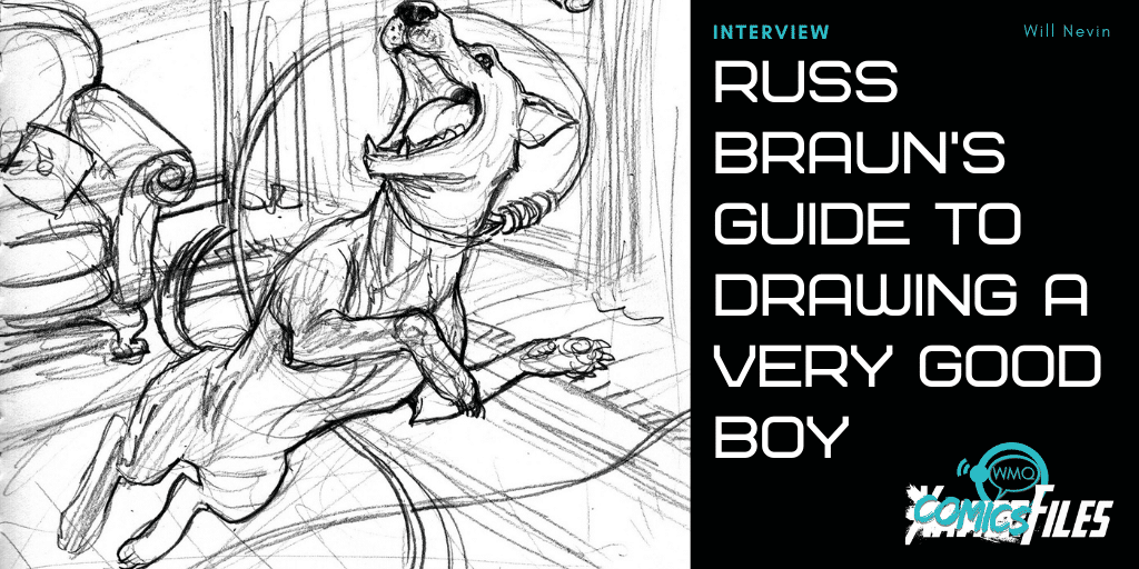
What follows is my email conversation with artist Russ Braun on his contribution to this week’s “Edgar Allan Poe’s Snifter of Blood” #1: a gleefully somber tale reimagining Poe’s “Black Cat” as a loyal, happy and (in a karmatic way) ultimately vengeful dog. Braun, a comic and animation industry veteran of more than 30 years, was good enough to walk me through every step of his process from his rough sketches to his finished pages.
You’ve done a lot in comics and animation — including working with Garth Ennis on “The Boys.” (Caught any of the series? What’s it like to draw these characters and see them in another medium?) But where did art start for you? What’s the first thing you remember drawing?
I’ve seen all of “The Boys” — love the show. There are odd moments when I see some scene or bit of action and think, “That looks just like I drew it,” particularly with Homelander. They’re doing a great job, taking it in their own direction and I wish them all the best (and can’t wait) for season 3.
I started drawing early, before I could read — and I was reading by age 4. I started by watching cartoons, the Spider-Man ’67 and Mighty Marvel Heroes shows, which led to comic books and then led to drawing comic books. Spider-Man was a big influence, and I remember drawing him early on, but I was always drawing Army guys and werewolves and dinosaurs, whatever got my imagination firing. Animation and comic books were my first inspirations, and I’m lucky enough to have worked professionally in both industries.
I notice most of your pieces start in comb-bound notebooks — why use those specifically? What are some of the other go-to tools in your arsenal, and how much trial-and-error did you go through before you settled on them?
I like the spiral sketchbooks because they’ll lay flat on the scanner. I basically draw everything out in the sketchbook, where I don’t have to worry about space and positioning; just keep it loose and find the poses and expressions I want based on my impressions of the script. When I started out in comics I would get so tense trying to make the drawings fit in the panels — nothing ever felt quite right, I’d do a drawing I liked, but a half inch away from where I wanted it, characters seemed “overly aware” of the borders cutting through them. So drawing things out on separate sheets of paper and light boxing them onto the boards became my MO.
Two more broad questions before I get into the specifics: How does your process work generally — from sketchbook to handoff to the colorist and letterer — and is there anything conceptually different in your approach here in “Snifter of Terror” as compared to “The Boys” or other superhero books?
Like I said, I draw everything out separately in the sketchbook and on scrap paper, then I scan it into the computer and build the layouts by shifting the individual panels around, zooming in or out, tilting, flopping, whatever I need to tell the story. Once I have the layouts/breakdowns the way I want them, I print them out to comic board size and draw a final, finished pencil page over them on the Lightbox. Drawing everything again might sound superfluous, but this is really my inking stage where I’m refining things, putting in details and unifying the world so that the page feels like a single unit of story instead of an assemblage of different sized drawings. I then scan the finished pencils in and darken and refine them further in Photoshop, filling in blacks and adding textures here and there, and that becomes my finished/ink stage. That gets formatted and sent out for letters and colors. And I worked exactly the same way on “Snifter” as I have on “The Boys” and everything else for the last 10 years or so.


OK, now onto the good stuff. As you open the story, what are your general goals for this first page? What do you hope to accomplish with it? And did you use any references for the pupper here? Is he a specific breed?
The first page has the Poe/Narrator panel break written right in Paul Cornell’s script — Poe leaning into the panel to talk to the Black Dog. It sets a meta tone right off the bat, and that works perfectly for the story Paul wanted to tell. I think I “got it” pretty quickly and tried to keep the tone walking a knife edge between dark comedy and… even darker comedy? The pup is made up for the most part, but based on my girlfriend Erin’s dog Ada, a terrier mix. Combined her with my recently deceased family dog Fletch, a black lab, and out came the Black Dog.


This second page is…strangely heartbreaking? The dog’s facial expressions kill me. How did you craft that “I’m just a happy dog” look, and do you remember what sort of direction you had in the script?
Paul’s script had all the pacing and humor set up for me; I just had to find the expressions and the tone. I got a good “Happy Dog” face on an early sketch. Repeating the panel with our terrible pet owner getting drunk, drunker and then psychotic, then the horrific result in silhouette was written; I just had to decide how far to take it. Animal cruelty is not something to take lightly, but I know it was a crucial part of Poe’s original and very important to the running gag of our tale — the difference between a good loyal dog and a self-interested cat in the role.


Did you ever think that, one day, you’d have a full-page drawing of a dog in a noose in your sketchbook? What’s the strangest thing you’ve ever put together for a comic? Also, like on your other pages, I see you sketch out space where the balloons could go — why is that important for you to do?
No. Of all the things I’ve had to draw for comics (and I’ve worked with Garth Ennis quite a bit), I never did expect to have a drawing of a dog in a noose in my sketchbook. I can’t really pick the strangest/most disturbing thing; I could list a few, or I could just say “read ‘The Boys.’” Or, for straight up bizarre/strange, refer you to the scene in Sixpack and Dogwelder where Dogwelder literally welds two stars together to save the Earth.
I’m always conscious of the space necessary for lettering. Lettering is part of the art, and the flow of it can make or break your storytelling (very lucky to have had Rob Steen do the honors on this one; a real pro and a good friend). If I draw an exciting, dynamic pose that fills the whole panel but doesn’t leave room for the lettering, I’ve quite simply failed at my job. It might look fantastic, but it didn’t serve the story. Comics is all about the marriage of words and pictures. I’d go so far as to say any art that takes you out of the story (that can mean an unusually bad drawing, a drawing that’s better than everything else on the page to a distracting degree or anything that makes you stop reading to look at the art alone) is failing the storytelling, the suspension of disbelief and ruining the experience for the reader.
*Steps off soapbox*


In this fourth page, we’ve got our pupper all stretched out to catch that stick (what a good boy) — what sort of challenges does an action pose like that bring up? I’m also struck here by what you can do just in black and white to demonstrate the absence of light or, conversely, shadows. What are some general lighting principles you keep in mind as you work?
Again, the sketchbook comes in handy working out that pose without restrictions. I drew it out full size and then tried to get as much of the action within the panel as I could when I built the layout. I’m also lucky our dog Ada likes to stretch out on the couch, the bed, wherever, in a similar pose. Lighting is also something working in pencil helps me with; I can get a soft edge if I want and don’t have to worry if I’ve gone too far with large, dark shapes. On the pages with fire, you get to have some nice high contrast — the brighter the light, the darker the shadows. I try to keep my lighting pretty simple but also try to have it all defined in black and white. I don’t like to leave the heavy lifting to the colorist. I want the colorist (in this case Andy Troy) to have fun with the pages but have enough of a guide so that they know what I intended.


At last, our pupper’s revenge (however unintentional it might be) is complete. What do you think about this whole story looking back on it now? Is there anything you’d tweak? Also, with this drawing of Poe, what were your key ideas when putting it together?
I love this story, mostly because I love the guileless, loyal pup. The humor, and darkness, is right up my alley. I’m actually a big Poe fan, and “The Black Cat” is one of my favorites. So this was kind of a dream project. Drawing Poe himself was fun; trying to get a likeness (there are not too many photos of the man) and still get the emotions and expressions across was a nice challenge. There are always things to tweak, fix, redraw — but I was taught a long time ago by some of the real greats of comics, “Don’t. Get ’em next time.” Meaning, of course, learn from those mistakes and improve upon them, as well as simply don’t dwell on the minutia.

Will Nevin loves bourbon and AP style and gets paid to teach one of those things. He is on Twitter far too often.