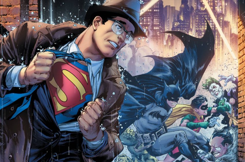
The World’s Finest Comic Critics assemble once again for Batman/Superman #17! Written by Gene Luen Yang, drawn by Ivan Reis, inked by Danny Miki, colored by Sabine Rich, and lettered by Saida Temofonte. This month’s issue finds the pair of super friends facing down the “auteur” behind last issue’s classic Hollywood-inspired hijinks. Thrown into a universe just a step beyond their own, Batman and Superman (and Robin and Lois Lane) must put things right if they hope to survive until the credits.
Justin Partridge: Welcome back, dear readers, to one of my favorite things I do here at CXF; SuperBatChat! Today we are going to examine Batman/Superman #17! The second installment in the Gene Luen Yang Era of the team-up title and another thunderously entertaining issue of comics.
With me as always to parse through all the fun is resident Gotham City archivist Matt Lazorwitz! How are you feeling this week, Matt?
Matt Lazorwitz: I’m feeling good. This was a good week in Gotham and, I suppose, a good week for floating in space above Gotham.
JP: HELL YEAH, that’s what we like to hear. Let’s boogie.
Back to The Turner Classic Movies-i-verse
JP: We open back up moments after the last issue where Batman and Superman have discovered a sort of technological infection spreading throughout a WayneTech satellite. An infection manifesting as a corrosive film strip interwoven throughout the orbiting tech. After being once again pulled into the strip by new villain Auteur I.O., the pair of heroes now have to navigate a twisted, pulp-inspired AU of their home cities.
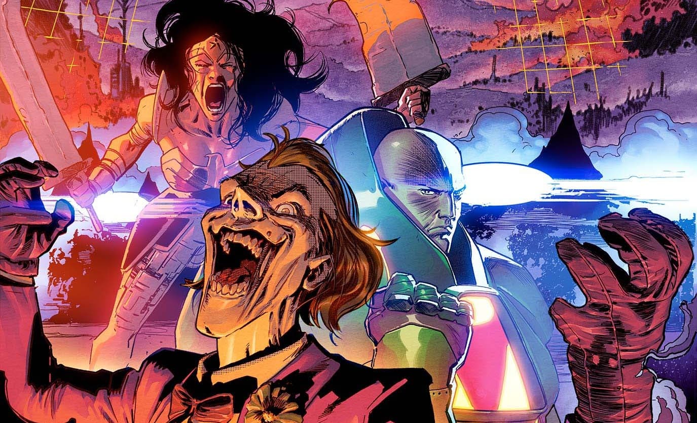
There are brand new twists on iconic Supes and Bat baddies like Lex Luthor (now the corrupt administrator of Arkham Asylum), The Penguin (with a hulking King Shark like upgrade), and the Joker (now looking like Junji Ito designed him and just wrote “Mouths” a bunch). I know readers kind of bristle at this stuff, but I had an absolute blast with it all. What about you, Matt?

ML: This is an AU, as you said, and one created by a being who considers himself this auteur director. I think this kind of thing plays into that perception. He’s edgy, weird and trying to create the ultimate version of these characters. I don’t think Yang is specifically taking a shot at the Justice League film, but the monster Joker and Penguin strike me the same way Steppenwolf did. There’s an edgy reimagining to make him look “badass,” only here it is being lampshaded, as opposed to played straight in whichever cut of that movie you see.
I don’t know how familiar you are with the old Giffen/DeMatteis Justice League era, but if you are, does Auteur I.O. strike you as having the same vibe as Manga Khan or Mr. Nebula? They were these weird cosmic figures with loopy 80s agendas, only a bit more sinister and more with these times.
JP: OH WOW YOU ARE ABSOLUTELY RIGHT. I didn’t even connect those dots. But you are absolutely right! Auteur I. O.‘s introduction is pretty silly on the surface but as their machinations become clear, it reveals a real deep well of menace that was just a delight to behold. I honestly think you might have stumbled onto one of the reasons why Yang works just overall. It’s silly and broad, and theatrical, but it’s informed heavily with real thematics and organic emotions. It’s a wonder to behold always.
The Boy Wonder Arrives!
JP: An interesting wrinkle, brand new for this follow-up issue, is the inclusion of Robin, the Boy Wonder! We got a few allusions to him in the opening issue, but Yang really goes for the gusto here with Robin. It’s a true delight! I know some may blanch against the more pie-eyed and broadly written brand of superheroes, but I can’t help but be charmed by it.
Last time we talked about how this series shares a lot of tonal similarities with the tremendous Superman Smashes the Klan and I feel like Yang’s version of Robin here is just that same stuff, just turned slightly to focus on the version of Gotham City that he wants to cultivate here. It is the kind where a kid can fight literal monsters, rocket out of a themed automobile, and think it’s the greatest job in the universe. It is broadly sketched, but it remains resonant and straight up FUN to read.
How about you, Matt, did you love this more “BIFF! POW!” take on Robin?
ML: Now, there was some Robin last issue (he got to drive the Batmobile while Batman fought Joker and Penguin, and Alfred told him to do trig homework), but he definitely gets way more play in this issue, and I think it works really well.
This came up before, and it’s going to come up again, but this Robin fits the story. In this issue’s Batman is a more clear character by having Robin. He’s not the grimdark, near lunatic Batman of the past. He’s not even the overly serious we sometimes get. Instead, we’re getting a more stable version. A Batman who has a Robin like this has more light in him, even in a darker world. It’s interesting this hit the same week as the new Batman: Black and White, which has a Bruce and Damian story that actually touches on something similar.
JP: ONE HUNDRED PERCENT! And again! In the hands of someone else, this might have been cloying or even maybe a little too saccharine with the “Hey, chum” of it all. But it’s just so SWEET and ENTERTAINING THROUGHOUT. We have talked a little off-page (JEALOUS?!) about how much we prefer when Batman actually SMILES and leans into the high-flying fun of superheroes. This take on Robin, as well as his crackling dynamic with his Batman, just delivers on that joy in spades.
Ivan Reis Is Good, Actually
JP: Finally, the issue is graced with a tremendous amount of old-school visual flair thanks to the pencils of Ivan Reis.
I know a lot of Discourse has been thrown around about the validity of the kind of older fashioned stylings and visual language throughout modern comics. Points have been made on both sides, but for my money, this still looks pretty great to me. DC recently lost the talents of Alex Sinclair, one of Reis’ regular colorists. Considering that aspect, the issue does look different thanks to the more modern sheen of Sabine Rich’s colors.
There is a further extension of the film reel visual transitions from the last issue. This includes a plot point being rooted in how issue #17 is laid out. More tremendously expressive character models throughout the cast. AND some pretty thrilling action set pieces to boot!
Am I projecting here, Matt, or am I just too excited about comics?

ML: See, here’s another reason why I do my best to ignore most of the Discourse around comics. I’m a soft touch in general, so I’m generally a believer that all art is valid, barring theft. Ivan Reis is suited perfectly to this story. To be fair, I’m also hella older than most of the rest of you whippersnappers who write for this site. Reis’s work is big, bright, and hearkens back to a time when this art would absolutely work on the story. Would Ivan Reis be a good replacement for Rod Reis on the Dawn of X-era New Mutants? No! Would Rod Reis’s expressionistic style work for a story that is so entrenched in the Golden Age as this one is? Also no. This isn’t me throwing shade at either artist, it’s just that the art should fit the story.
The film motif was a clever last issue, and finding a way to incorporate it even further into the narrative is a bit of brilliance to me. I think I said something like this last issue, but this is a narrative device that would only work in comics. I like it when creators use the medium to its fullest extent.
JP. ABSOLUTELY! We talked a little last column about how amazing it is when you see visuals and panel transitions that could ONLY exist in comics and this issue was just more of that. And somehow actually BETTER TOO? It’s truly insane.
But you are absolutely right! I’ll admit a little jealousy at your disconnection from the Discourse, but you nailed it in terms of his tonality. Ivan in general really trades on “old-school” visuals and a broader sense of kinetics, which obviously won’t work for certain books. Here, his style keeps SINGING, and we don’t even really feel the loss of his regular colorist Alex Sinclair either! Just truly fun and beautiful looking stuff throughout. This book continues to be a wonder and I truly cannot wait to see where it goes from here.
World’s Finest Miscellany
- We are really enjoying how this current era of comics is really giving Lois a lot to do in the issues. Not only is the emotional core of a lot of these books, but she’s also actively driving plots and scenes. It’s been really nice to see after the largely lackluster Lois stuff in the previous volumes.
- God, these old-school costumes still rule, huh? Robin’s especially has some neat tactile details like the creases of his domino mask and the look of its stitching. It’s good stuff.
- I feel pretty dense for not having recognized Lex Luthor as the head doctor at Arkham. That goatee is really distracting. Maybe a better disguise than a pair of glasses…
Matt Lazorwitz read his first comic at the age of 5. It was Who's Who in the DC Universe #2, featuring characters whose names begin with B, which explains so much about his Batman obsession. He writes about comics he loves, and co-hosts the podcasts BatChat with Matt & Will and The ComicsXF Interview Podcast.

