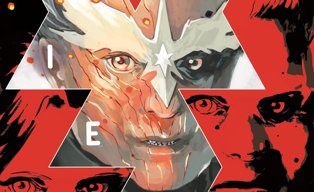
Atticus Sloane — misanthrope, criminal, asshole and vampire — lives in a world where blood isn’t the only thing vamps crave. And for the right price, he’ll make you a vampire, too. After all, immortality isn’t cheap in Blood Stained Teeth #1, written by Christian Ward, drawn by Patric Reynolds, colored by Heather Moore and lettered by Hassan Otsmane-Elhaou for Image.
I was excited for this comic.
Now that I’ve read it, I still am. But it has less to do with this first issue and more with the hook behind the series.
“Vampires as metaphor for capitalism” is a great hook. It’s one of those ideas that seems obvious in retrospect: Taking one of the central metaphors of the vampire myth and updating it for our times. Long ago, the idea of living forever, always looking young, having almost supernatural sway over other people, the ability to soar above the rest of us, etc., seemed magical, like something that could only be achieved by creatures beyond mortalkind.
In a way, that’s still true. But the billionaires of the world are a lot closer to living that kind of life than the rest of us lowly humans. Having access to the best health care, power over media and politics and their own space rockets fulfil a lot of those vampire qualities.
It truly seems like there’s a lot of good, interesting stories that can be told from this idea. Sadly, not much of that is shown in the first issue.
Now, it is by no means a bad comic. Ward, Reynolds, Moore and Otsmane-Elhaou* are all competent creators, and they do create an interesting comic. It just reads more like a trailer than the first issue of a series. It moves too fast through the scenes to give us a proper idea of the characters and the stakes involved (no pun intended).
The issue opens with a data page, telling us about the world and its rules: “There are two kinds of Vampire. One is born. One is made.” From the start, it’s clear that there’s a divide between the people of the world. It goes further into how the First Born Vampires are the haves of the world; “The world is theirs,” it explicitly states. They (try to) control the world and decide how other people within it should act. It’s a clean and simple way to give us readers a lot of information about the world, which helps provide context to what follows.
As the comic begins proper, we see lead character Atticus Sloane ascend a set of stairs, in an image that’s a clear homage to the classic vampire film Nosferatu. In fact, almost the entire opening page has homages to past depictions of vampires. It’s drawing a line from those vampires we know and to Sloane. It’s a way to show that he’s part of the First Born. And then the team makes it clear that despite that, he’s not like the vampires we know.
The clearest indicator that this is a different kind of story is that Moore’s palette shifts dramatically. From a more naturalistic, “normal” coloring style, it changes to the almost garish, trashy-direct-to-VHS ’70s exploitation flick vibe that permeates the book. It instantly sets Blood Stained Teeth apart from anything else on the shelves, due to the coloring style alone (with the possible exception of some of Jacob Phillips’ work, which draws on some of the same stylistic inspirations). It’s not pretty, it doesn’t look “real,” but it certainly helps set the mood and tell the story. This isn’t a pretty world, after all.
Otsmane-Elhaou’s lettering does many of the same things, though more subtly. The first page has some captions, which are all fairly standard, though there are still interesting things going on when one looks closer. The first two are completely standard, square boxes. But as Sloane’s narration shifts, and he claims that he doesn’t care about humans’ stories (more on that in a minute), the caption boxes also subtly shift. They become more jagged, with less clear lines. It’s Otsmane-Elhaou’s way of showing that this story isn’t as clean-cut as we might’ve assumed. It’s rougher and a lot less polished. The lettering is telling us a lot about the world and the story through small, important choices.
Another example is the name cards for the characters. The name of Sloane’s “victim” is flat and in a single color, whereas Sloane’s is both in multiple colors and raised into a slight 3D version, popping off the page, making it clear he’s both more important and just more than her. All from seemingly small design choices in the lettering.

It’s all in the service of telling the story, creating a mood and building a world. Ward, Reynolds, Moore and Otsmane-Elhaou definitely succeed in this. Which is why I’m so disappointed that I don’t really care about the people in it.
This is especially sad because I feel like there’s potential for something interesting here. Hell, me not caring might even be on purpose. Sloane proclaims on the first page that “The humans always want to tell me their stories. They come to me thinking I care. I don’t. I just want their money.” He is, clearly, not a nice guy.
But that’s hardly different from many of the leading characters in pop culture these days. Walter White, Tony Soprano, Negan, Saul Goodman, most of the characters in Criminal and on and on. Yet we’re all invested in them and what happens to them. I’m just not there with Atticus Sloane. I don’t feel like the team gives me a reason to care.
There are hints, sure. He proves to be an unreliable narrator, as he opens the issue talking about how he doesn’t care about human stories. However, near the end, it’s revealed that while he doesn’t care about human things, he does care about human art. Which is the main way we tell our stories. So maybe he does care about us and our stories after all. That’s interesting and hints at a duality that he probably isn’t even aware of himself. Hopefully he does care, because otherwise the issue’s cliffhanger falls flat and his mission going forward will be fairly easy for him.
This potential duality is, however, about the only interesting thing about him.
Otherwise, he seems fairly boilerplate as an anti-hero: “He’s a bastard, but less of a bastard than the other bastards!” He isn’t really given a chance to do something more interesting. Because the issue moves so briskly through the scenes that it’s hard to get a gauge on what kind of person he (or any of the cast, for that matter) is. It’s all quick hints at characters.

Naturally, this is part of a first issue. There’s a lot to establish, and that’s no easy task. I just can’t help feeling that some of the pages could’ve been used better. The scene in the hospital is more confusing than intriguing. Yes, I get the feeling these characters will turn up again at some point (We do see one stalking Sloane at the end, with hints of future complications), but mostly I’m just wondering who they are, why they matter to us and Sloane, and perhaps most confusingly, why we’re seeing a flashback that takes place 15 years ago, when the scene immediately before ends with the characters talking about something that happened 40 years ago. It all just leaves me confused and cold on the story.
Which (with the fear of repeating myself) makes me sad. I know the team is capable of doing something interesting. Ward and Reynolds make each character distinct. They all have their own look, feel and voice. It’s all very capable work. The characters exist in a world that’s carefully built around them, with each member of the creative team doing their part to make us understand and feel the world.
I just wish I understood, felt and cared about the characters as much.
*For full disclosure’s sake, I am a regular contributor and writer for Otsmane-Elhaou’s PanelxPanel magazine, though I’ve done my utmost to not let it influence my review.

Rasmus Skov Lykke
Rasmus Skov Lykke will write for food (or, in a pinch, money). When not writing, he spends his time with his wife, their daughter and their cats, usually thinking about writing. Follow him @rasmusskovlykke.bsky.social.