Deathstroke’s Secret Society attacks Titans Tower in Dark Crisis #2. Written by Joshua Williamson, art by Damiel Sampere, colors by Alejandro Sanchez and letters by Tom Napolitano.
The problem with writing about a book like Dark Crisis is that it’s nothing. There is nothing here to engage with. Nothing here to talk about. Its very existence is nothing more than fellatio for the long time fans who will never leave. There is nothing here to engage with save bullshit continuity that never actually makes a lick of sense, but we pretend it does anyways. As if Alan Moore didn’t resolve every single bit of continuity error, failing and what not in two sentences:
“This is an imaginary story. Aren’t they all?”
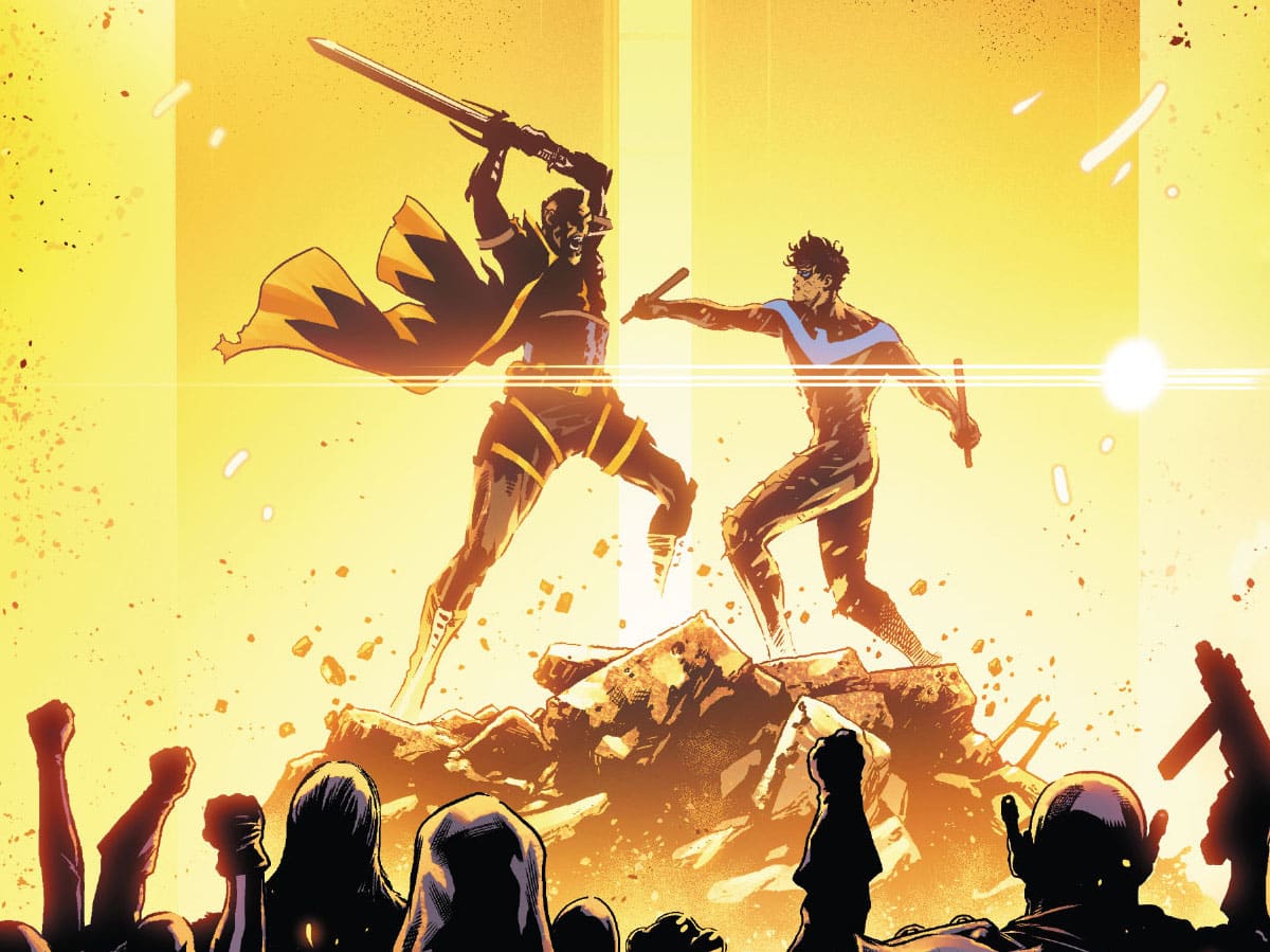
There’s nothing here. It’s just… look at this fight scene between Deathstroke and Nightwing:

This is shit. This is absolutely, positively dog shit. It’s trying to go for a contrast of images between the small panels depicting the actual fight and the spread showing the two combatants going at one another. But it’s extremely lacking. The panels themselves are flat and uninteresting with a bland background of pure pale nothingness. This is especially galling considering the pair of them are fighting in front of a fucking fire. There’s nothing dynamic about the specific panels themselves either. Nothing that contains the raw energy of Dick Grayson and Slade Wilson fighting for the last time for the fifth time (only not really). It’s just basic punches and jabs with a pole emphasized with generic lettering and crudely added in splatter effects.
Contrast this with, say, the opening page of Batman: Killing Time #5:

While not attempting the full page spread contrast that Dark Crisis #2 is going for, its depiction of small events nevertheless is stronger. Both issues were colored by Alejandro Sánchez, and he does terrific work here, making each moment of this chaotic battle impactful. Look at the background he uses. The colors are dynamic dark reds and purples accentuated by speedlines. Even the small splatter feels right, with its dark black instead of the basic reds. Every moment feels impactful, feels important.
And the same aspects I’ve described could’ve been applied to Dark Crisis’ big showdown, but weren’t. Certainly the size of the panels adds to the impact, but then one has to look at the work done in Batman #12:

Much like Dark Crisis #2, we are presented with a two page spread accentuated by small moments with colorist June Chung going for a nondescript, pure background. But the color Chung opts to go for is a harsher, more dynamic yellow to highlight the impact of each punch. Instead of a generic sound effect, there’s a flash of light. Even the relative bloodlessness of the moment doesn’t take away from the pain inflicted. In fact, it’s arguable to say that it’s even more impactful by virtue of the speedlines utilized. We understand what’s happening here, how the fight is going down. The page tells a story.
By contrast, what story is being told in the Nightwing/Deathstroke pissing match? The comic says Nightwing wins, but it barely looks like Deathstroke is even trying here. He doesn’t seem to care about kicking Nightwing’s ass. His punches and kicks feel too soft, too easy. It’s basic. There’s nothing here to inspire anything more than rote competence.
And that’s the ultimate failing of every single DC Event, bar two: They think the best thing a comic should be is competent. The comic’s main action opens with the reveal that no, they didn’t kill Beast Boy. But why not? Yes, it’s rote and basic to kill a comic relief character, but it’s even more so to make the audience think you did, only to not own up to it. Otherwise, there’s nothing at stake. Nothing matters. See you next crisis.
There’s nothing here worth pulling from. Nothing to inspire the next generation of comics writers. If they are reading capes work, they’re probably going to respond more to stuff like Ram V and Rafael Albuquerque’s Detective Comics, Tom King and Greg Smallwood’s The Human Target or Kieron Gillen and Esad Ribic’s Eternals. But more likely, they’ll be drawing influences from elsewhere. Webcomics like Rachel Smythe’s Lore Olympus or Sarah Jolley’s The Property of Hate, manga like Naoki Urasawa’s Asadora! or Tatsuya Endo’s SpyXFamily, non-big two titles like Nadia Shammas and Sara Alfageeh’s Squire or Tillie Walden’s are you listening?, or non-comics works like She-Ra and the Princesses of Power and The Boys. Works that challenge the medium of comics in strange, interesting ways.
At the end of the day, Dark Crisis is not interested in being the future. It’s not interested in engaging with the possibility of being more than running in place doing nothing. The future is coming, it cannot be stopped. Running in place will only get you consumed by its tidal wave.
Stray Thoughts

- I hate every last detail of this panel
- Why is Black Adam admonishing Superman for the failure of his Justice League when he went in alone? Or is he saying Superman sucks because he went in alone?
- For those curious, Final Crisis and Heroes in Crisis. And when the bar for second best DC Event Comic is that low, the vast failing to get over it is telling.

Matt Lazorwitz read his first comic at the age of 5. It was Who's Who in the DC Universe #2, featuring characters whose names begin with B, which explains so much about his Batman obsession. He writes about comics he loves, and co-hosts the podcasts BatChat with Matt & Will and The ComicsXF Interview Podcast.