Kicking off our new year, the Redesigning X-Men crew of artists elected to take on the southern belle herself, ROGUE!
Check out our artist’s fantastic interpretations of new costumes of Anna Marie herself – and please follow our very talented artists on their social media linked below!
Karen Charm

My friend and I have long talked about Rogue being into latex/PVC/fetish type stuff on account of her powers, and I really liked the dramatic lighting you can get from that material. My favorite Rogue era is the mid-80s around Mutant Massacre so that’s kind of the basis in terms of silhouette, colors, and styling. I was going to give her a helmet that evoked my Destiny redesign., but ultimately I liked having the transparent, plasticy areas for her neckline, built-in face mask, and hip cut-outs. That way she’s showing off some of her deadly skin while still covered almost head to toe.
Kenneth Laster

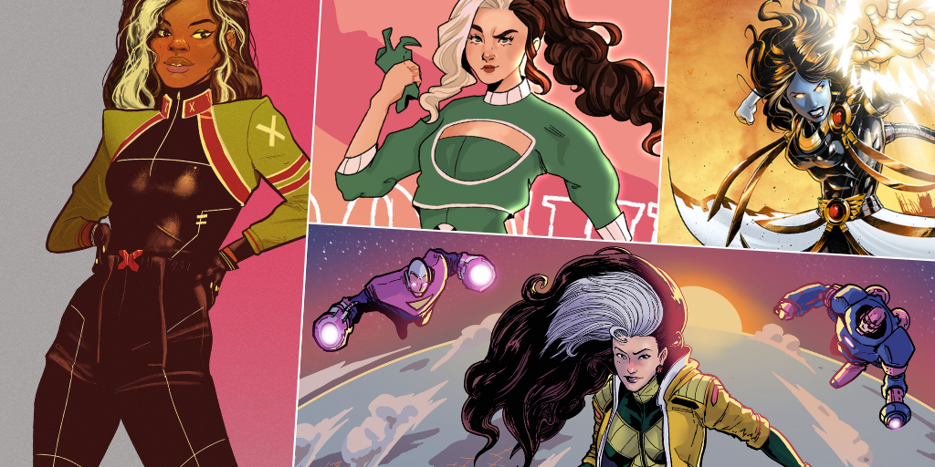
I didn’t pursue the likeness, but being Keke-pilled, I really wanted to do a Black Rogue. From there, I wanted to chase the silhouette of her first Hellfire Gala look and incorporate a lot of design elements from her history in a somewhat simple look.
Andrew Drilon

I leaned into the idea of a “rescue worker” Rogue for this one, hence the high-visibility yellow jacket, medpack and panels. I think it fits the powerhouse side of her, with big hair and a carefree smile on her face. Even surrounded by several Sentinels, there’s nothing she can’t handle. The costume silhouette nods back to Jim Lee’s design from the 90’s as well as one of my fave costumes, her Shi’ar mining costume from UXM 342-343 by Joe Madureira.
John Caden

Rogue has had many great costumes over the years, and I’ve always been partial to a good bomber jacket so I wanted to focus on that first and foremost, while also pulling from the skirt from the Carey era. Big hair is a requirement here. Also some comfortable shoes are a must. But I stuck mostly with the “if it ain’t broke, sugah” – as Rogue herself would say.
John Marsh

Rogue’s a slugger, so why not lean into it & let her be a wrestler?
Alex Buckland

Went for something a little sporty and a little cute. Who doesn’t love a classic layering moment!
Bradley Clayton

For my Rogue redesign, I wanted to capture all the classics of some of my favorite costumes and try to make it all into a cohesive whole. I wanted the sporty nature of her 90s look along with the mystery of her various looks with hoods and scarves. Green is so severely her signature color and I threw in some exposed skin because my Rogue is feeling brave and flirty. Lastly, it called for a bit more drama so I gave her these cool sleeves that make for fun shapes as she flies around punching monsters or whatever.
Josh Cornillon

Sleeveless, chaps, big sexy hair, big sexy biceps. I went way more traditional superhero than I usually do for these challenges, to prove I could!
Joshua Bruckner

My favorite incarnation of Rogue is teen goth Rogue from X-Men: Evolution, so I went with a mature take on that. She’s showing a lot of skin through fishnet stockings and some daringly cut clothes. There’s a bit of Olivier Coipel’s fabulous Rogue art too with the aviator sunglasses!
Hector Barros

I wanted to reflect several of Rogue’s more iconic designs through the years, while trying to keep it simple. My design for her looks sporty and functional, dressing her for the job she wants: the tank of the group. I prefer the green variant, but I couldn’t resist including a yellow and green combo.
Adam Reck

As the nukes fly and the Age of Apocalypse comes to an end, Rogue holds her husband Magneto’s hand and absorbs his powers. Earth-295 may be over, but Rogueneto lives on, driven mad by loss, dimension-hopping in search of her lost family. Woe to anyone who stands in her way!
Stephen Reinfurt

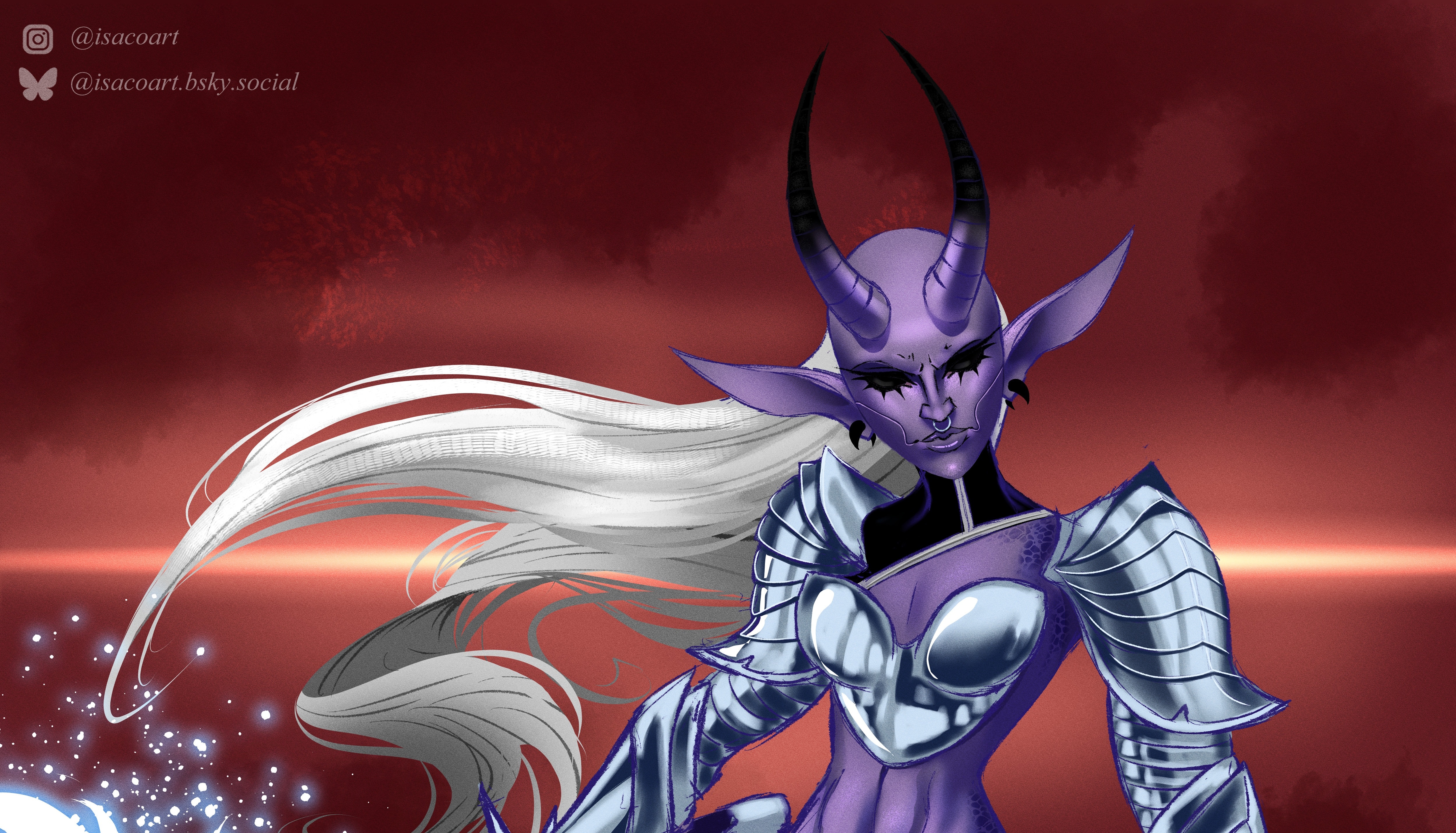
I had some fun with my Rogue redesign and did a combination of her and one of my favorite X-Men characters, Apocalypse. Most of the design elements were inspired by his X of Swords costume.
Giovanni Saroldi

Motivation: Rogue is usually the team’s “tank”, so I wanted this aspect to be reflected by her body type. I tried to lean towards a “fighting game” design, using some iconic elements of hers while changing them or blending them together. The shorts are from her road trip with Iceman in Uncanny X-Men #323 (I think) and the braids come from the intention of using her main recognizable element as a defining graphic design.

