David Nakayama is the acclaimed artist, highly sought out after for his covers. He has a diverse background, having been an Art Director in videogames and doing commercial packaging art for Hasbro among others. He sat down with ComicsXF to discuss his process and approach to art.
Zachary Jenkins: You’re often called to draw 90s X-Men: The Animated Series inspired products or that early Jim Lee zeitgeist era. But I would not describe your style as very reflective of that. I’m curious how you go about capturing that kind of early Image, Jim Lee, Marc Silvestri energy with big action, and crosshatching versus your more clean, polished style.
David Nakayama: You’re absolutely right. Jim Lee, Marc Silvestri defined that era with lots of crosshatching and that sort of specific 90sway of going about things that other artists aped up and down for, for a good five, six years. I think me and a lot of the kids I went to school with when comics were really hot and when everyone was trying to draw comics and collect them; we all started there.
My first sketches ever as a young artist were like that, but then I had this chance meeting with another hero of mine at a San Diego Comic Con one time. It was Adam Hughes, he was standing in the DC booth. I had a portfolio that I had sent in to go to the Kubert School and I thought, well, this is my one chance. I gathered up all my willpower and forced myself to go speak with this guy that I had basically adored. He spent a good 20 minutes telling me all kinds of great, useful information about work. And the one thing he inspired in me is when he said that every line in your drawing has to mean something, it has to be there for a specific reason. And that’s the antithesis of the crosshatched style, right? Crosshatching is building up a volume collectively and Adam Hughes thinking is the opposite of that. It just clicked in my brain, it makes sense to me. That’s how I got off of the multiple line thing.

But at the same time, my brain is all wired from 1990s comics. That’s how we think about drawing and comics in general. Jim Lee goes for energy and I still feel like I’m always trying to, to chase that to some extent. I think when people look at my stuff, they might detect a whiff of that because it’s still in my heart. In my brain, my artistic brain, I’m still thinking about how Jim Lee makes comics, but I’m also thinking about how other people approach comics, including Adam Hughes. I guess that’s how you get to my particular weird mix of art.
And then the third leg of the stool, I guess, is I spent 12 years in the video game industry learning how to Photoshop paint and that it has changed the way I do art as well. I’m not thinking in terms of building up lines to create a volume. I am thinking more about chunking colors in Photoshop. So much of that work gets done in the color phase. I don’t traditionally ink and color at all anymore. I do kind of a rough pencil thing that gets immediately turned into color. So the methodology went its own way.
ZJ: Speaking of video games, you were the art lead on Marvel Avengers Academy. Which is a game that was very memorable for its character designs. What did working in that industry, specifically on some of the same IP, teach you that you brought back into comics.
DNA: That was a very unusual game. They were trying to try something really different there, the way it was described to me when we first started out is that they wanted to have a four-quadrant game, which is a term I had not heard before. And what that means in marketing speak is they want to have male, female, young and old demographics? So can we make a game that is equally enticing for men and women?
The basic theme is that basically Avengers in school, college age Avengers, that kind of thing. There had to be some fighting and action components with any good Marvel thing, but we also wanted to have this slice of life, relationship, friend, friendship, dating kind of aspect to it, too. That’s where all the design challenges came from, making it work for both. I’m really proud of what we came up with artistically. I think it worked.

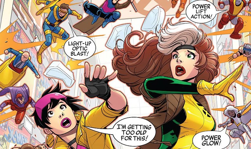
What did I learn from that? I guess it’s that if we want the audience to continue to grow we do have to make things that are as broadly appealing as possible. Coming from the 1990s, it was pretty strictly material made for young boys, in a very Shonen kind of way. A lot of fanservice-y stuff all over the place that was just built into the DNA of mainstream comics at the time. It wouldn’t fly anymore. You would never see that in a mainstream comic anymore. How do we keep Emma Frost as sexy and compelling as she was at any time in our history and yet keep, keep her out of her underwear where it’s objectifying? There are definitely ways to do that. But I think that’s where we are right now. I don’t think that you lose anything keeping her out of just her underwear. You don’t have to lose what’s sexy about her. She can be extremely sexy, fully cloaked, right. You lose nothing and you gain an audience.
ZJ: On that front, you’ve done a lot of variants where you are kind of pulling some of those same levers, redesigning a character, or putting them in a different setting than they normally would. When you’re doing those designs, how do you balance keeping those iconic elements that say, for example, “yes, this is Storm but also this is definitely a pirate”?
DNA: It turns out there’s a formula for it, and we discovered that on Avengers Academy in a codified way. You go back to Understanding Comics with Scott McCloud and he makes that amazing point that most superheroes can be broken down into a two to three color swatch. I don’t know if you guys remember that Hulk is, for example, like green and then purple underneath it, just seeing those two colors in that combination is enough to make you think of The Hulk.
That kind of is still true for just about every character. Let’s say you’re drawing Iron Man, and you need to communicate him as a college age student as we did. Well, you got to have X amount of red. You gotta have X amount of yellow. And, you know, he probably needs to have some little element of tech on him. We gave him a gauntlet and some boots and it’s enough; that and the arc reactor. So there’s these iconic features, the swatches. And that’s it. That’s all you need to communicate.

Building on that, you were talking about this Marauders pirate cover. We did Emma Frost and Storm as pirates. Emma’s just decked out multiple layers of this British style uniform all in white. That’s all you need to communicate her.
ZJ: What’s your approach to designing a comic cover versus something like key art for a consumer product?
DNA: There are similarities and there are big differences. With a comic cover, I’m trying to be a little more outside the box, a little bit more creative and different and experimental. I feel like the market right now rewards that “I’ve never seen that before. Like, Oh my gosh, I must have that. That’s so unique and cool.” We’re doing a series of these covers where almost the whole cover is just one color with little highlights that lets you kind of pop out the figure and those have done incredibly well. You try a bunch of things and sometimes something pops. I feel like a lot of artists are doing experimental interesting things and those things tend to rise to the top.
Now compare that with the commercial art stuff. I think you really can’t do that in that case, what people want is iconic recognizability. The character has to be exactly how people imagine it has to look just like the product. It’s ideally on the box where oftentimes you have issues where the packaging has a very unusual shape. You might be working in a tall vertical format. So these rules about characters being as horizontal as possible for maximum action? That goes out the window because they have to be standing basically straight up. That’s the major difference?
ZJ: I want to talk about a recent project that you got to unveil. You collaborated with Hasbro and the Transformers line doing the art for Ultimate X-Spanse, which is a Blackbird that turns into a Transformer.

DNA: It’s the thing you didn’t know you need, but you definitely need it. I got that vibe after I posted it. People are like, “what, what is this? This is amazing. I need this. I want to hear the story. What’s the lore, like, what, I mean, how does this work?” But it’s just another fun idea they’ve had in this series of IP crossovers. There was like a Wolverine Transformer thing in the past but what’s different about this is that they’re starting from the vehicle point of view. So what better vehicle than the Blackbird to sell X-Men? Putting in familiar X-Men and visuals on top of it just brings it all home for me. I thought it was really inspired, really different when they told me about it. And I’m like, “Yes, this is amazing. Definitely want to do this.”
ZJ: Was the packaging design work that you did on that any different than what you do for something like the “Marvel Legends” line?
DNA: Yes, very much so. One thing that happens in, on the Hasbro stuff is they liked to mix up styles. They want to have very specific styles and approaches depending on the character or the line that they’re working on. So with that one in particular, they wanted retro nineties all the way, and they were going to mimic the packaging that was made during the nineties, and they wanted a style that reflected the nineties. That’s why it’s line art. It’s coloring the way maybe something like a Liquid! would have colored back in the day. Likewise for the Age of Apocalypse line, it’s the same thing.
If you look at all the packaging art I’ve done, it’s pretty different from one to another. The Punisher motorcycle, for example, is about as realistic as I can draw. No lines at all, very muted colors, and then quite the opposite for things like Squirrel Girl or Deadpool, or any of this retro stuff.
ZJ: I have not seen this Punisher motorcycle. I need to pull that up. [muffled sounds of Google search] That is, Oh, okay. Yeah. That is not something I would have immediately, pined as you.

DNA: And that, and that’s the funniest thing. What happened to me after video games is, each game has to have its own visual identity. You can’t draw every single game one after the other the same way. Harry Potter is a very dark and black kind of IP compared to young Avengers like we were doing.
Over the years, I learned how to draw in all these different styles. At first I thought, coming back to comics after a while as a cover artist, I thought, “Oh, this is great. I’ll just be the guy that has all the styles. Editors will just assign me a style and I’ll just match whatever.” But the problem with that thinking is that if you’re all the styles, then you’re none of them. Your branding is weak because no one can recognize you from cover to cover. So in comics at least, I try to be very consistent, or more consistent at least. I still try to be experimental, but I try to be more recognizable from one cover to the next, just so that people even know what DNA is.
ZJ: You were in comics for a bit before you left. It’s been a while since you’ve done any interior work. What made you want to leave the interior side of things?
DNA: It’s a bunch of stuff but, my love for sequential comics has never gone away. That’s still really close to my heart. I think often about what I would do were I to come back to it. I’ve definitely had ideas of what would my own series be if I were to do a creator owned, for example. It’s economics at this point.
It would take me all month to draw a comic and it would be at the expense of any other job I could do. Right now I’m juggling something like 10 to 12 clients per month. In a lot of cases, comics is the lowest paying of all the work that I do. So not only would I be dealing with the opportunity cost of all the clients, I couldn’t work for just by taking on that one monthly job, but also I’d be paid less on a day-to-day basis because the page rate is so much lower. So if we could get the economics of it to work, I’m in! But now I have a family so I’m more worried about what I am bringing in on a month to month basis?
ZJ: Speaking of family, there is a property that you had a hand in that my boys are very much fans of and that’s Big Hero 6. You co-created Fredzilla and Wasabi-No-Ginger. I’m curious seeing that translated into film, what was your mindset on that? Because you didn’t come up with the whole concept of Big Hero 6, you added a bit to it.
DNA: That’s true, I think that’s fair. It makes sense to go back and look at where that even came from. Big Hero 6 was Steven Segal and Duncan Renaldo, so both are founders of Man of Action. So they created the original incarnation of Big Hero 6. Now that incarnation has Baymax as a giant green monster. He is like, technically a robot, but he is a giant green monster.

So when we restarted the comic with [Chris] Claremont writing and me drawing they unusually just said, “Hey, you know go ahead and redesign everybody.” And so I’m thinking to myself, okay, first of all, I’m going to make Hiro as cool as I possibly can. Let’s give him the anime hair, give him a cool jacket, keep the glasses, Disney dropped those. But otherwise we gave him a little bit of an upgrade visually which I felt Disney mostly kept. Next thing I did was I thought, okay, wait, Baymax is a robot. How come he doesn’t look like a robot? So I turned him into some kind of Mecha, vaguely Gundam looking thing, and a Disney kept the robot idea, but did their own thing with it. So I felt like I had a piece of that as well. Gogo, the yellow one, did her like a Masamune Shirow kind of design. Disney dropped that completely. They did their own thing with Honey Lemon as well.
The two brand new characters that were created for the mini series that I did were Fred and Wasabi. They were both Japanese and in our comic because the whole point was that the team was from Japan, this is what’s going on in the Marvel universe in Japan. Disney threw that out too. Overall I really enjoyed the movie. I’m like, wow, this is cool. This thing that I worked on, that I made, I felt ownership over is a movie. Do I feel like they could have made a cool movie out of stuff that was a little closer to the source material? Yeah, I do. I don’t particularly see why it couldn’t have been an all Japanese cast for example. But overall, I’m really pleased with the movie. I liked the movie. I have a copy in my collection. It’s really nice to see a credit at the end of a film, so I can’t really complain.
ZJ: What you got on the table next?
DNA: You know, I went freelance. I had been on salary as an art director for many years in games and what kept happening is I would come home and I would miss comics. So over a course of several years, I started building up this other job doing covers. Eventually. I just decided this is where my heart is. If I’m working all day at the video game company, and then I come home and do the comic stuff just because I need it in my life, why am I not doing that? So I just went full freelance. And then fortunately, all these clients started showing up and now I’m fortunate to have more work in a month than I could possibly do.
It’s such a diverse amount of stuff. It’s not just comics. Sometimes it’s video game work, sometimes it’s toys stuff, sometimes it has to do with TV and film, and I love that. I love that diversity, sometimes when you’re in the game situation, it gets tiresome doing the same thing or the same kind of thing over and over. You can’t complain too much about making a video game about your favorite characters, but after the 100th ortho [the turnaround drawing] is something that becomes just sort of factory work. My day to day does not ever feel the same. I’m constantly trying to come up with something different. So that’s why I love it.
What am I actually working on? I’m really excited right now to be working on some concepts. I am consulting on a Marvel video game project, very different from the other stuff I’d done before concepts and ortho’s re-imagining a character that you all would know very well. I’m loving it. It’s really fun. I can’t wait to see what they do with it in the game.

Zachary Jenkins co-hosts the podcast Battle of the Atom and is the former editor-in-chief of ComicsXF. Shocking everyone, he has a full and vibrant life outside all this.