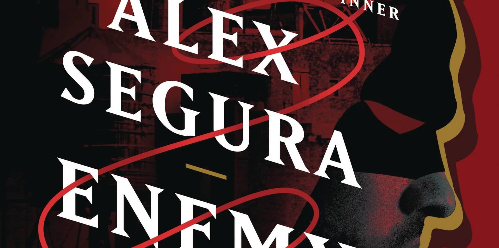
We get a taste of Disney’s newest park with an alternate universe of our beloved wall-crawler in WEB of Spider-Man #1, written by Kevin Shinick, art by Alberto Alburquerque, colors by Rachelle Rosenberg, and letters by Travis Lanham.
WEB of Spider-Man is an odd story.
When Disney Parks announced Avengers Campus, everyone knew this was coming. The previous big IP park addition- Star Wars: Galaxy’s Edge- came with a novel, a comic miniseries, a cookbook, an in-universe tourist guide, and much more. If it wasn’t for the pandemic, I’d fully expect that we would have seen all of those same media tie-ins. However, we are getting this series, with I’m sure more to come.
In today’s “IP is king” entertainment and media landscape, this was bound to happen. Ever since Bob Chapek took over Disney’s Parks, Experiences and Products division in 2015, there’s been an active effort to incorporate more IP into Disney Parks, and that means certain divisions become marketing tools for the parks. From a cynical standpoint, it’s impossible to see this miniseries as anything but a cash grab- creating a story that can be easily picked up in trade from the gift shop after riding Web Slingers at Disney’s California Adventure, much like the Star Wars: Galaxy’s Edge series Marvel published in 2019.
The odd thing about it is that there’s no Avengers Campus branding on the cover, and the name of the Spider-Man attraction at Avengers Campus is Web Slingers- A Spider-Man Adventure, not WEB of Spider-Man. WEB is a big part of the story of the theme park area, but again there’s nothing to tie this to the Avengers Campus, in the story, the back matter or even a logo on the cover so you’d know that reading this. Hell, the story itself doesn’t take place on Avengers Campus- it happens in the WEB headquarters building in the middle of NYC. If you didn’t know that this was explicitly a tie-in to a theme park attraction going into it, you’d probably be confused as hell.
In comparison, 2019’s Star Wars: Galaxy’s Edge was written with a framing sequence set on Batuu’s Black Spire Outpost, the galactic way station that Galaxy’s Edge was set within, and focused on the Ithorian Dok-Ondarr who you could actually visit in the attraction. It centered the story on the familiar characters and settings then drew them to Batuu, tying the attraction to the lore of the universe we know and love. The branding was strong, built in the service of telling a good story tied to the attraction. It made the attraction relatable, which made me recognize the significance of the locations as I visited Galaxy’s Edge myself in September of 2019. Unfortunately, that’s not the case here in WEB of Spider-Man #1.
All that said- what about the story itself?
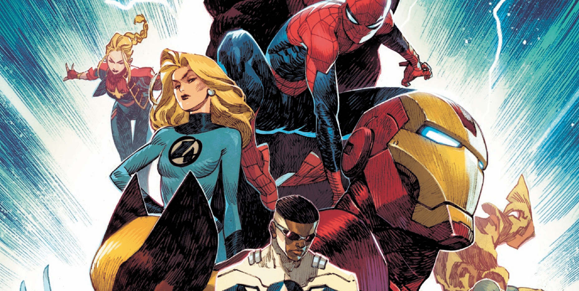
It’s pretty fun. Shinick has a good handle on Spider-Man’s voice (which shouldn’t be a surprise considering he’s written Spidey several times before and he’s a comedy writer). Peter’s personality comes through quickly and carries the book through. The supporting cast is great (surprise Squirrel Girl and Moon Girl!), and each have a unique voice. The plot actually feels like an adaptation of a theme park ride’s plot, even though this story doesn’t have anything in common with the actual plot of Web Slingers.
The biggest issue with the story is the same problems with the Spider-Man of the Marvel Cinematic Universe- Peter’s over-reliance on Tony Stark. This story takes place in an MCU-adjacent continuity, which is established through dialogue, but also clearly isn’t the MCU itself. That means lots of references to Iron Man and Mister Stark, to an eye-rolling degree.
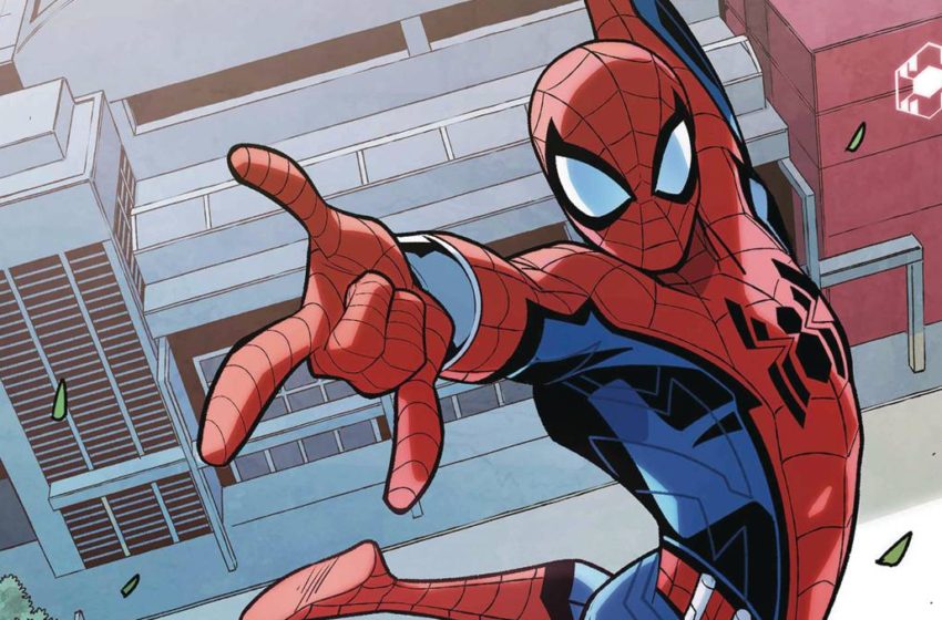
For the art, Alburquerque does a solid job with Spider-Man and the supporting cast. His action is solid, with a great flow across the page and through splash pages. All of the young stars look and feel like teenagers rather than shorter adults (with one exception). The tech also looks great, thanks to Alburquerque’s designs and Rosenberg’s colors bringing it to life. Lanham also handles some incredibly wordy balloons and captions really well.
The biggest issue from the visual side is Peter Parker himself. Peter looks about ten years older than the teenage cast, though dialogue and captions place him as their peer (and Shinick is clearly trying to evoke Tom Holland’s speech patterns in his writing). If he had drawn Peter looking more like Holland or even Bagley’s Ultimate Peter, it would have worked, but this looks like the late-20 something Peter from this week’s Amazing Spider-Man instead.
In the end, it’s a fun little story that will sell well in the gift shops at Avengers Campus, but ultimately is going to be extremely forgettable otherwise. However, for a monthly serialized miniseries on the direct market? It’s incredibly weird, lacking a large pile of context, and is going to be confusing for a lot of folks picking it up in their local comic shop this week. So maybe save this one for when you exit through the gift shop.

Tony Thornley is a geek dad, blogger, Spider-Man and Superman aficionado, X-Men guru, autism daddy, amateur novelist and all around awesome guy. He’s also very humble. Follow him @brawl2099.bsky.social.