Over the weekend, a project by Reddit user /u/hbicofhbic got some attention in the comics sphere. The user is recoloring 2019s House Of X #1 with a limited pallet and flat tones to reflect the pop art style of a bygone age. It is a fascinating example of coloring through time and a reminder of the power a colorist has to make a title work.
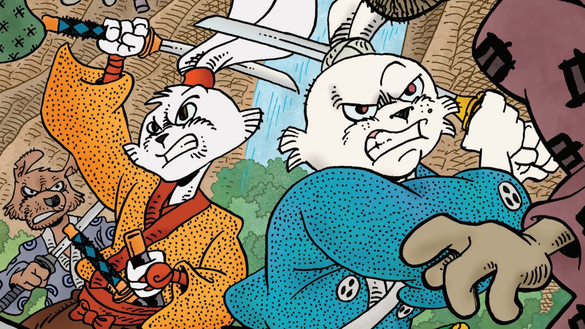
In the same way, the most striking thing about Time Before Time #2 is Chris O’Halloran’s choice of color. To start, O’Halloran uses flat colors across the board, a technique that has three major effects on the book. The first is tonal. While I wouldn’t categorize this as a joyous book, colors that invoke a simpler time help buoy a book that could get drug down in the muck and mire of crime drama. It allows the audience to build some distance between themselves and the protagonists. It screams “comic” and our brain kicks into subconscious bias mode and starts to bring forward all the thoughts and feelings we have about “comic” as a concept. It’s possible that O’Halloran is using this to lower our guard and subvert expectations. This is, after all, a crime story, and those tend to end in bloodshed.
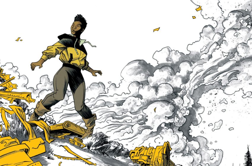
The second is in color density. On a given page there are only a handful of colors, most of which are used for our character’s clothes. These chunky swaths of color allow the mind to better abstract the situation and follow the action. The purple blob is Tatsuo. The yellow blog is the FBI agent. We can easily pinpoint them on a page, zero in on them in a panel, and allow ourselves to process the more complex movements.
The third big advantage is in the use of shadow. O’Halloran balances his vibrant colors around artist Joe Palmer’s pitch-black inks. This builds off the first two advantages. The chunking of blacks helps abstract the scenes. It tells you to look for the colors, know that what’s obscured isn’t worth the mental bandwidth. It also gives the book a distinct personality. The deep blacks work as a strong contrast to the coloring, helping images pop off the page. It stylistically adds depth to pages that would otherwise look flat while maintaining the title’s identity.
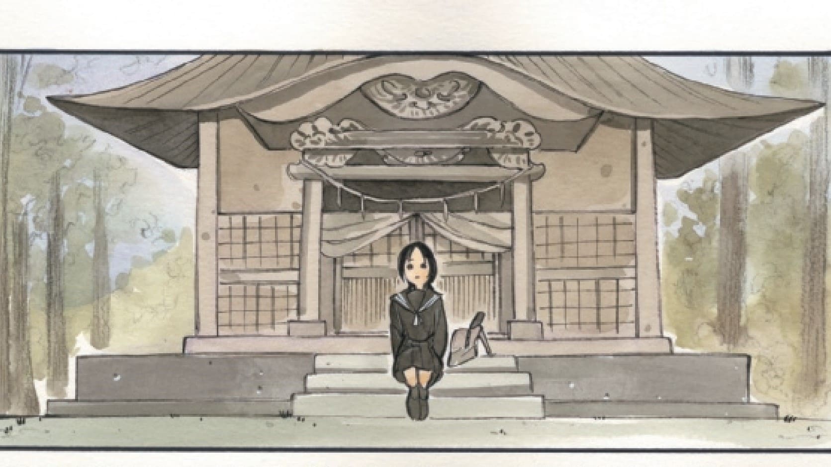
O’Halloran also employs another trick when it comes to colors, something that’s a common tool but executed to perfection here. The dystopian future (present?) of 2141 is defined by unnatural darkness. It’s blacks and greys and desaturated blues with the small pops of light that leave a neon-soaked impression of a cyberpunk future. Traveling back to our other local, 2093, we see a heavy emphasis on natural colors. The dirt is brown, the sky is blue, the trees are green. If 2141 is the consequence of man’s mismanagement of our natural resources, 2093 shows us a world where it isn’t too late. No matter what rules are established about time travel, that’s the promise, isn’t it? That there is somewhere better than here. The promise that you can fix your mistakes.
That’s the story Declan Shavey and Rory McConville are telling. It’s about regret, being caught up in something you never intended on being in, turning into a person you never wanted to be. It’s about how things have broken and asks if we still have the time to fix it. Comics is a collaborative medium where “artist” and “writer” are reductive terms that can’t capture the impact each creator has on a story. There’s a hierarchy here, with readers and critics lauding the wunderkind writers as the creative vision and simplifying an artist as “good” or “really fitting”. What Time Before Time #2 provides is a strong example of how the role of a colorist can deepen that storytelling and make those damn writers look a hell of a lot more talented than they actually are.

Zachary Jenkins co-hosts the podcast Battle of the Atom and is the former editor-in-chief of ComicsXF. Shocking everyone, he has a full and vibrant life outside all this.