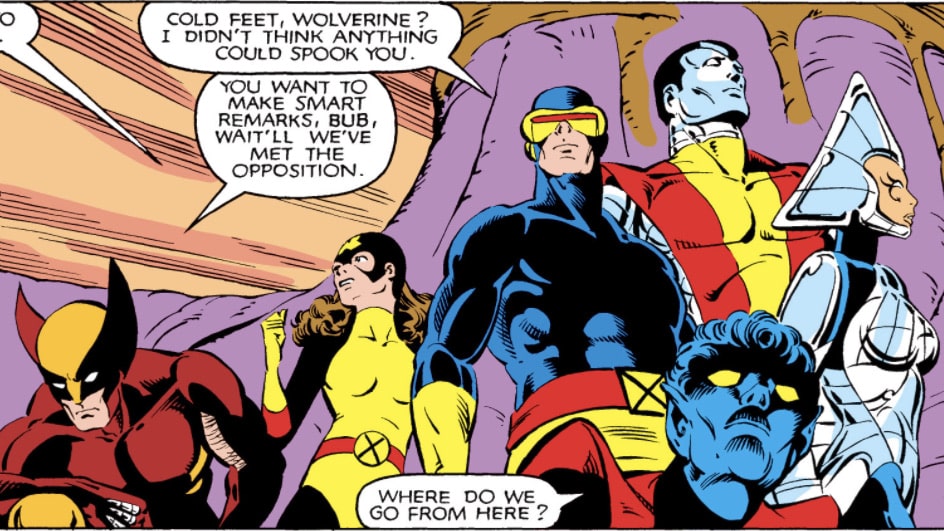
Compared to other creators, Paul Smith drew very few issues of the Chris Claremont-Era Uncanny X-Men—ten issues between 165 and 175, and then a single-issue fill in years later, for #278. These weren’t the totality of his contributions; he also drew a few issues of X-Factor and an X-Men/Alpha Flight miniseries, among others, but for an era when there weren’t nearly a dozen X-Men ongoings, his run was much, much shorter than most of his contemporaries. However, what he lacked in quantity, he more than made up for in quality. Here are a few of the most famous panels in X-Men history, all penned by Smith:

These are all iconic images, key touchstones in the history of mutants-as-pop-culture that people (including myself) will tell you are some of the true greats. Once again: Paul Smith drew ten issues of Uncanny X-Men, in a pair of five consecutive issues each, with a one-issue break between them, and then a single issue more nearly a decade later (comparatively, John Byrne drew 32, Dave Cockrum 31, John Romita Jr. 43, Marc Silvestri 31, and Jim Lee 15). Every single one of those artists has done massively memorable work on the title, but only Lee comes close to that fame/quantity of work ratio. So what is it about Smith’s work that endures? Well, that’s the lesson here. Economy.
In an interview with Amazing Heroes around the time that he started working on Uncanny X-Men, Smith told interviewer Kim Thompson:
My drawing has simplified itself a great deal. I wanted to be Neal Adams for the longest time, and I became much more interested in the line than in the form; this is not to say that that’s what Neal’s doing, but in looking at the superficial aspect of Neal’s work I became enmeshed in this linework without understanding the reason it was there, and in animation you can’t do that – you’ve got to deal strictly with form. That’s all you have time for. So that was a very valuable experience.
Amazing Heroes #12
It’s important to note that Smith never received a formal education in art; he simply, by his own admission, never stopped drawing. He had creators he looked up to, like we all do, creators he wanted to emulate, but his style evolved organically to fit the needs of his career. When he discusses things here like learning form and letting that guide his work, it’s apparent.

Take the page of Kitty Pryde, above. No one would make the mistake of calling this page simplistic or undetailed! Note the sheen of the metal on the doorknobs, the way the puffed up fabric of Kitty’s jacket bunches around her elbows. Note the way her hair trails lightly with the speed of her turn, or the seams on the fingers of her gloves. It’s solid, impressive technical work, but look too: he saves time (and evokes the material’s iridescent nature) by doing almost no shading on the jacket at all. The lines visible on her pants give the impression of slight folding as the fabric gives way to her movements, but stops short of rendering those folds in detail. The snow and the sky both are rendered in the simplest manner possible; nearly empty spaces filled by color, contrasting against the tones of her clothing so that she stands out nonetheless. Even her face follows this formula; her nose may in fact be a little under rendered compared to her prior appearances, but it’s in the service of conveying her youth. There are no dimples, no lines at her eyes, only a single dash to suggest a cheekbone, a light curve to hint at a brow being knit. Smith mentions that he once wanted to be Neal Adams, but in practice his work as a creator took him down a very different path. Where Adams is known for his hyper-detailed rendering, Smith accomplishes marvelous, memorable work with an absolute economy of line use.
This is not, of course, to say that Smith is correct and Adams isn’t! In fact, Adams has worked in this way as well, as witnessed in his work on X-Men #58:

Unlike Smith, Adams attended school for art, and that shows here in his work; a depowered Iceman has his musculature shaded in detail with heavy ink work to separate shoulders from biceps, a shiny metal floor is scored with dozens of lines to give the impression of a dull reflection of the room’s ceiling above it. But note Havok’s presence in the scene; where many artists might use darker toned blues to detail his musculature against a black suit, the way it might be used to detail things like Superman’s hair, Adams abandons that entirely, leaving Havok’s form as a light-swallowing void, a negative space that hangs over every panel he’s in. It would be easy to attribute this to Tom Palmer, the inker, but Adams and Palmer were both interviewed in Comic Book Artist #3, where this exact work was addressed:
It was like a mime who moves around—you look at the silhouette of the body; you don’t look at the interior of the body. It seemed to me that that would be a great idea for a costume—the idea of doing a silhouette like that and then doing the energy. So if you speculate on the idea, you can say that the costume isn’t really a costume; it is a kind of energy container through which you can actually see the energy inside of his body. So many guys draw Havok with this thing on his chest and that’s not the idea; you’re supposed to be able to see in the middle of his chest the energy no matter where he turns.
Tom Palmer, in order to help me out and delineate the drawing, added highlights to Havok’s costume. I explained to him, “Tom, I’ve drawn the character in such a way that you can tell what he’s doing in every silhouette—you don’t have to worry about it; remove the highlights.” While there are positions you could put such a character in so that you would need highlights, I made it my business when I did Havok not to put the character in those positions. If you limit yourself to certain positions, you would never have a problem; the audience never loses track of it and they get it every time. That was the philosophy behind it.
Havok was certainly not a Jack Kirby-type of character; he was something new and different, and a little hipper.
Comic Book Artist #3
It’s both the same technique and not; above, Kitty glows with the neon of the 80s and the fire of youthful righteousness, while Havok here is conflicted, brooding, and that’s conveyed in the oppressive blackness of his presence in the scene. Both Smith and Adams are evocative of the art that was contemporary for them, the art they came up seeing, and both have taken that art, analyzed it, stripped it down and adapted it into their own style.
In this way, it’s possible to even read Smith’s work as a critique of Adams’, especially given his words in that interview and his discussion about taking the time to understand why lines were laid down, and when. Whether one should read his work that way or not is a separate conversation, but this is the nature of art, and make no mistake, criticism is art, thus, art can also be criticism.

On the subject of knowing when and where to lay lines, Smith’s panel framing is an important thing to observe. His history in animation carries through to his sequential work most clearly in the way he draws combat; note here in Uncanny #170 how he first establishes the scene of the fight. Faint, yellow lines denote reflected light hitting the cracks and the lines in the tunnel’s ceiling; the area is lit, but not enough for anything to shine. He provides the scale of Storm and Callisto’s makeshift arena via the circle of the crowd in the background; though we can only see part of it, we can surmise the arc, and thus the general size of the space.
Also of particular note are the two Storm panels in the lower half of the page; the tall, narrow one emphasizes the downward trajectory of the knife, whereas the wide one shows the speed at which she snatches it from the air. Many comics-first illustrators might have done this with simple speed lines, but Smith once again shows his animation background—five separate fully-drawn iterations of her left arm. An enterprising creative could make an animation of that panel alone with very little work.
This understanding of not just anatomy, but how bodies fill space is a hallmark of his work, and the reason Smith’s short run remains iconic amongst the list of artists who worked on Uncanny X-Men in those days. Below is a page from issue #174. Scott Summers has just shown Madelyne Pryor her first Earthrise, a romantic moment that’s interrupted by his father, Christopher.

In the ensuing conversation, as the topic turns to whether Scott will be joining his father’s crew, note how Madelyne is interposed between them. She’s fallen silent here, because this isn’t her conversation yet—it’s her first time in space, and while she and Scott have been romancing one another, they haven’t established the full boundaries of their relationship yet. Many artists simply would have put her to one side or another, and let the panels focus entirely on the conversation between Scott and his father. Under Smith’s hand, Madelyne remains between them for the entire conversation instead, her arm hooked around Scott’s, looking and listening attentively to everything being said. She’s present in the moment, and she has thoughts, ideas about the discussion. Madelyne here is more than a prop, she’s a fully realized character.
Of course, she’s also symbolic. Smith’s work here leans into the thematic, as not only does Madelyne physically occupy the space between the two men, but she occupies the metaphorical distance between them as well. As Christopher poses the question to his son, it’s Madelyne that Scott looks at, because it’s Madelyne who has become his priority. She is both literally and figuratively between him and his father in this scene, and that’s down entirely to the care and precision present in Paul Smith’s visual storytelling.
As I mentioned earlier, his total output is much smaller than that of his contemporaries on the title, but in the same way that Adams influenced a generation of artists toward more detailed anatomy, Smith’s storytelling prowess would influence later artists (and presumably, Marvel editorial’s selection of those artists) as well. John Romita Jr. and Marc Silvestri’s runs are inimitably their own, but both feature character work that eschews the hyper-detailed Adams style in favor of dynamic composition and storytelling. Both also retain a fluidness in their linework that separates them from the more hard-edged character work found in Jack Kirby or Don Heck’s work, for example, and evokes those animation sensibilities set down by Smith. Truly, a lasting legacy.

Nola Pfau is Editor-in-Chief of WWAC and generally a bad influence.