When an executive at a 1960s stock brokerage acquires a collection of antiquities, the gap between the haves and the have-nots becomes painfully clear. The price of the Silver Coin keeps going up, even as the fortunes of its owner plummets, in issue #8, written by Matthew Rosenberg, drawn and lettered by Michael Walsh, and colored by Toni Marie Griffin and Walsh for Image.
Mark Turetsky: Hey Ritesh. Do you like Mad Men?
Ritesh Babu: Yes! I love Mad Men, flaws and all.
Mark: Well, this issue of The Silver Coin takes place in the mad world of Wall Street in 1968 and tells the story of two men who’ve become obsessed with a certain coin.
Who Watches the Night Janitor?

Ritesh: It is very much the first touchstone that popped into mind on that striking first page. I’m surprised by how well Walsh pulled that off. That one page alone made me yearn for a whole comic just set in that horrid, broken world of office desks and window panes.
Mark: The use of the nine-panel grid throughout really does mimic the shape and distribution of office windows, doesn’t it? I found it really effective here, as the layout becomes architectural as well as aesthetic. Sometimes we’re seeing two panels that represent adjacent offices, sometimes they’re just comic panels. This is the most formalist issue of The Silver Coin yet. And yes, I realize that formalism ≠ nine-panel grids, but in this case it happens to be true.
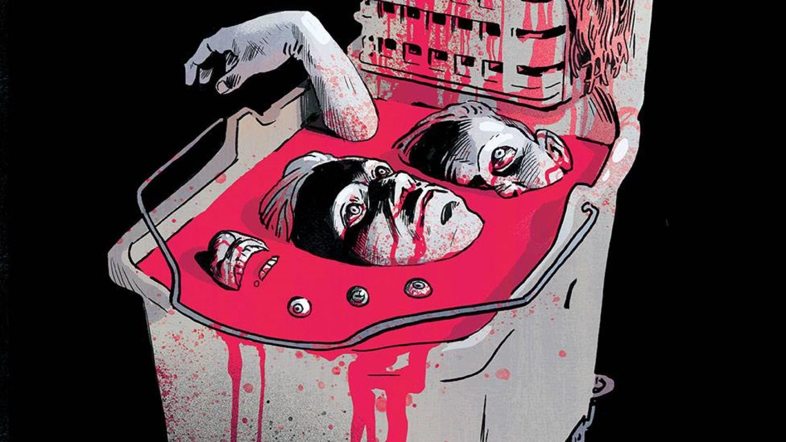
Ritesh: I’m glad you brought up the art-as-architecture part because that was the first thing that registered in my mind as I looked at Walsh’s cover.
My first thought wasn’t “Oh, wringer,” it was “Oh, building,” because that’s what that resembled to me, at a glance. This small bucket for a mop with all those holes, almost looking like a building in miniature, with those holes like windows into rooms. A building with a pool of blood at the back, full of human corpses, as the blood taints and covers the building itself. This large, grand structure for hundreds of people reduced to just this small thing, a dirty little chore of cleanup. I don’t know if it was intended or totally accidental, but I found it a rather powerful opening cover. Perhaps my favorite to date?
Mark: That’s a really good catch (not least of which because I didn’t catch it myself)! It absolutely does look like a postwar office building, before they started being sheer expanses of glass. I’m glad in this case that Walsh didn’t opt to give the wringer 18 openings so that it would look like a spread of two comic book pages. That would have been a step too far.
Ritesh: Hah. Yeah, particularly given we witness the fall of a man later on. I’m just glad that we never got an issue of The Silver Coin with the title on the left-hand side, with a close-up on a coin and a splash of blood over it.
Mark: Maybe if this issue gets a second printing? Just one last note from me on the formal elements. I’m glad that my digital reader gives the option to show all the pages of a comic at once, so it’s really easy to see the “game” at work here. We see the coin “fall” from panel to panel, starting with the top left one, moving one tier down per page, making its way from the top left to the bottom right over nine pages, followed by a full page splash. Then we get the same pattern repeated with the hand reaching after it for another eight pages, then a splash, then the ninth page in the “hand” pattern and one last splash. It’s a really nice way to establish a rhythm, then break it and vary it in only 21 pages.
Ritesh: Oooh, I just went back and re-read the issue, and you’re right! That’s a great little touch I didn’t catch at an initial look. Dang, that’s good. We’re getting the ending scene in hyper-slow motion throughout the comic one panel at a time (with the narration setting it up) and we don’t even know it yet until that final page wherein we arrive at the payoff wherein he’s caught the coin (and fallen to his death right after).
Mark: Yes, with the exception of the last few pages, which I think is not the falling man’s hand, but the hand of the unhoused man that we see on the final page picking it up off the ground. We see that the falling man has it in his closed fist in that splash page (Oof, that takes on a grisly meaning, doesn’t it?), having caught it in midair, and he drops it when he hits the ground.
Grabbing for the Brass Ring

Ritesh: All that pointless suffering and carnage, and for what? Nothing. Absolutely nothing at all. That’s what the whole book seems to repeatedly underline, and it’s what the opening captions draw attention to as well, talking about how people envision themselves as the people at the top instead; that’s the fantasy sold to them, so they’re willing to not only put up with anything, but do anything. It’s about the sad, hollow futility of that, and the brutality of that. The Ram V issue tapped into this sentiment best, with its careful construction. And this issue does a solid job as well, being set on Wall Street, especially in the ’60s. That gives it a very specific texture, I think.
Mark: Reminds me of this excellent tweet I saw the other day:
And going into the issue, we think the captions (the only ones in the issue) are the point of view of Henry, the janitor, but they’re in fact from the beggar he meets throughout the issue. And the title of the story, “Rising & Falling in America,” sums up the rat race, but also the phrase is a common variation on Gibbon’s Decline and Fall of the Roman Empire. To use a reference to that in your title, it doesn’t imply that you have great hope for the American empire.
Ritesh: It’s rather hard to have much when you look at the news and see how shamelessly transparent about their callous monstrosity so many of its leaders are, eh? The cold, uncaring “Well, that happened, I guess” shrug of it all, the cycle just going on and on, as the next poor bastard picks up that coin. That’s this goddamn ugly system of evil in play once again. It just feeds on people, this parasitic power. It devours them whole. Henry was happy, content in some measure, if you can call it that. He had a family. And then the family for which he earns is shown butchered, as he’s become a murderer. He’s taken the life of the one and only person who meant the most to him … all for this. For this promise of shiny nothing, behind which just lies inevitable self-destruction. It’s not unlike how the lead in the Ram V issue gave up his relationships for his hedonistic rise, which just ends in his demise.
Mark: Each issue opens with “a curse needs to feed,” and it’s just like how capitalism needs continual growth to thrive. Ritesh, when did we become such parodies of ComicsXF writers?
Ritesh: Haha. And yet that’s very much the truth of the work. The idea of “a blood sacrifice” as needed, as necessary, as the only way, capitalism as curse, it’s very apt. That moment wherein Henry just pushes Louise like that still very much sticks with me. It’s such a simple bit, but you’re not quite expecting it until it happens, and it shocks you, while being a “ah, of course, I see.” Louise must die for the deluded dream of this man. Surely that man had a family, he had his own dreams? But we’ll never know them or get to see them. And neither will he. Perhaps then “sacrifice” is the wrong word. Sacrifice implies you give up something to get something. Here you get nothing at all. It’s the illusion of sacrifice. It’s a false promise. It’s the delusion of getting something. Perhaps that’s why we live in the times of NFT insanity. It’s that capitalist delusion in its most absurdly blatant manifestation.
Mark: The Silver Coin is very much the first non-fungible token. This issue has so many memorable images, but I think the one that sticks with me the most is the 18th page. Its nine panels of the office building are almost a direct callback to the opening page of the issue, where Henry is in the center panel, falling from the top tier to the bottom one. We see workers in the adjoining offices becoming more and more frantic as the coin reaches its full power over them. On the left panels, we see three different office workers. It almost looks like they’re the same person, having their attention drawn to the falling man, then starting to pick up their office chair, then finally throwing it, but the offices are different. The furniture is different, the blinds are at different levels, the chairs are a different design (the one in the bottom panel looks like a Herman Miller Aeron, which is a bit anachronistic, as it was only released in 1994; also Herman Miller created the concept of the office cubicle in 1964!), but the sequence still creates a sense of time passing, making the layout both sequential and architectural at the same time. And finally we see those office workers in mid-fall on the final splash page, chasing that cursed dream. Really effective stuff.
Loose Change

- What did Pynchon offer the coin dealer to change his mind?
- Between the executive office and the Mayan temple, that’s two issues in a row where our focal character falls from a great height for the sake of the coin.
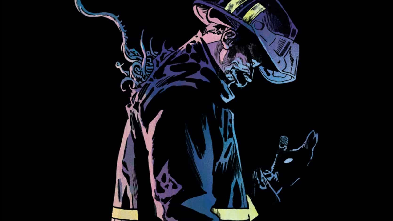
- Next month, Vita Ayala writes a story about a crooked cop in the South Bronx. Is the Bronx burning? You betcha!

Mark Turetsky

Ritesh Babu is a comics history nut who spends far too much time writing about weird stuff and cosmic nonsense.