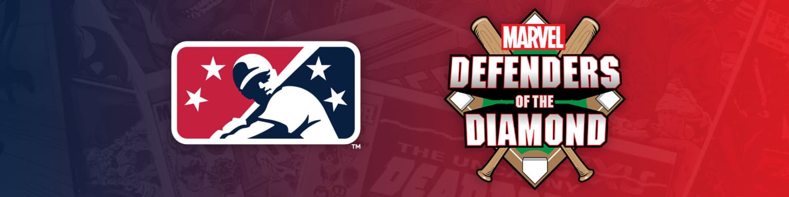
Baseball. It’s America’s pastime as long as you don’t count football or basketball or soccer for the under-30 crowd. Another one of America’s pastimes, despite the substantial efforts by Disney and Warner Bros. Discovery to suck any childish joy we once had for it, is superheroes. Great news for lovers of pastimes that are past their prime, 96 Minor League Baseball clubs have teamed up with Marvel Entertainment for a promotion called “Marvel’s Defenders of the Diamond,” in which the most shameless promotional entities in the world combine their power for synergistic marketing.
Now when I say shameless, it’s important to know that when Minor League Baseball does it, it’s a beautiful and charming thing, and when Marvel does it, I turn on all the cynical energy I can spare.
For the 2023 season, Marvel’s designers — the same company behind the logo for Bishop: War College — have redesigned every minor league team’s logo to be superhero themed. Is this an excuse to sell hats? Yes. Will I be buying the Marvel-themed hat for my hometown heroes, the beloved Fort Wayne Tin Caps? No, but that’s only because their Marvel logo is bad and I have a one-baseball-cap-a-year allowance and damn it if I’m not going to spend it on the hat with a big pork tenderloin on it.
Because the bread and butter of this website is ranking things, and because we want to honor the legacy of site founder and current fugitive Zachary Jenkins, we ranked all 96 logos based on how good they are as superheroes.
Strike Out

The #1 thing I would avoid if I was redesigning logos to be superhero themed would be making logos that look like normal logos. Now credit to the Asheville Tourists, that’s some Kirby Crackle around their … umm … moon? Golf ball? But look at the Rome Braves, whose logo somehow looks more like the Atlanta one than their standard logo. Shoddy workmanship on that. This is a Minor League Baseball promotion, go big or go home.
Foul Ball

Now these logos here, these are mostly trying to be superhero logos. They don’t succeed, but no one bats 1000. These, unfortunately, fall under the Mendoza Line. It’s not because too many of these look like furry avatars drawn by non-furry artists, or that the dead eyes of the Reno Aces logo follow me wherever I go, or that the best of these look like XFL alternates. No, it’s because these do not spark joy. They are the dregs from an underpaid designer who I am sure gave their best on the first 60 of these and then broke down saying, “Screw it, I’m giving the Modesto Nuts guy a cape and going home.”
Single

OK, now we’re cooking with gas. We got the Rancho Cucamonga Quakes dinosaur looking like he just listened to “Saturday Night’s Alright (For Fighting).” A Guy Fieri-inspired duck for the Las Vegas Aviators. A Watchmen riff for the Worcester Red Sox. And what I can only describe as a sexually deviant, truck driving monkey for the Arkansas Travelers. This is the energy I want to see.
Triple

Fans of the Tampa Tarpons and the Lake County Captains, be proud, you have a new logo that will cause confusion and sexual awakening in an upsetting number of people. I would extol the virtues of the forgotten 12-issue miniseries starring the logos of the Aberdeen IronBirds and the Sugar Land Space Cowboys. The Eugene Emeralds make the bold choice to celebrate Oregon’s novel and progressive positions on drug possession by having their logo run around with the dankest of nugs. These are the kinds of logos Ike Perlmutter could be proud of.
Grand Slam

Here they are. Your starting lineup. A stunning showing by the Biloxi Shuckers, Daytona Tortugas, El Paso Chihuahuas, Great Lakes Loons, Hillsboro Hops, Jersey Shore BlueClaws, Kannapolis Cannon Ballers, Rocket City Trash Pandas and Stockton Ports. These are logos that represent the power of both superhero comics and Minor League Baseball. When I think about why I’m going to more than five minor league games this season it will be logos like this and also $2 beers every Thursday.
That’s the truth, and if you disagree, read this comic book where the writer understands that playing baseball is an X-Men thing but after years of intentionally not marketing the franchise, he’s stuck having Captain America in his promo book.

Clark Urich has been called "The Lester Bangs of Comics" in that he too has overdosed on NyQuil