I’d struggle to call Time Before Time novel, but then again, I’d also struggle to call it bad. What writers Declan Shalvey & Rory McConville, artist Joe Palmer, colorist Chris O’Halloran and letterer Hassan Otsmane-Elahou do here is more of a synthesis of existing ideas rather than creating something whole cloth, but should that be held against them? There is nothing new under the sun, even the best of ideas are mostly revamps or remixes of existing ingredients. It’s why sites like TVTropes can be so mesmerizing; the human brain loves categorizing things and distilling them into their core components. And maybe that’s what Time Before Time is. The team put their hands into the bag of ideas and pulled out cyberpunk, time travel, and crime drama, and decided to spin a story out of it. The kicker? They executed it well.
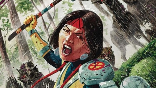
Time Before Time is set in a cyberpunk dystopia where an indebted Syndicate employee named Tatsuo smuggles people through time, out of the hellscape that is 2140. There are echoes of the film Looper with the shady organization, the old warehouses, and the mundane applications of time travel. However, Shalvey and McConville add a lot of heart to the tale. There’s a crucial moment where Tatsuo is listening to an old friend describe what the business has done to him. At its core, it’s a pedestrian scene, but it is executed with a deft hand that causes the moment to stick with you. The build-up, the reveal, the misdirection, the gut-punch; it’s nothing new, but how the team pulls it off is impressive.
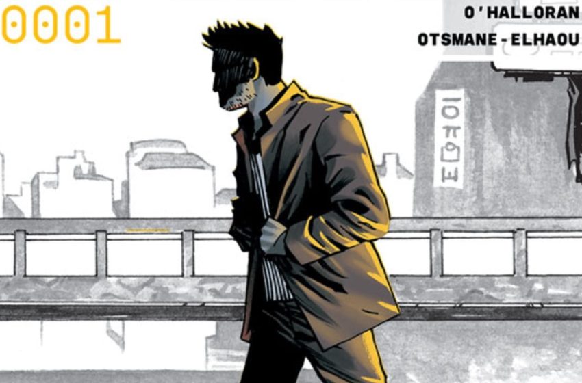
The standout of this book is the art of Joe Palmer and Chris O’Halloran. Palmer takes a page from Mike Mignola with his figure work. There are geometric figures and heavy use of shadow work within bold, black lines. Like Mignola, there’s a hyper-reality to Palmer’s art, and that energy serves the title well. But O’Halloran breaks from the gothic influences with a muted, but varied pallet. Its grimy purples on dusky greys give the book a sense of personality. When a new character appears in a vibrant yellow jacket, the book signals that she is someone to pay attention to. It’s a small trick, and an old one, but still effective.
There are details that work here to make the book feel more special than it otherwise would. Designer Sasha E. Head put together an impressive visual identity for the title. It’s clean with highlights from that same yellow our second lead jolts onto the page with. It does a lot of heavy lifting to establish a vibe for the book. Similarly, instead of being shoved in the caption box of an establishing shot, the dates of the different time periods we visit are plastered top center of the page in a smart sans-serif font that bleeds into the border. The when isn’t just a detail to know, it is the detail to know, and the title tells you that organically.
I’d struggle to call Time Before Time novel, but then again, I’d also struggle to call it bad. This issue sets up a world, introduces a struggle, and provides enough forward momentum to keep me invested in the next issue. The promise here isn’t that you’re going to get something you have never seen before, it’s that you’re going to get something done well. There are a lot of comics that make a big splash in the pan with a high concept, only to fizzle out with poor execution, but I don’t expect that here. Time Before Time has a strong foundation to build on; we’ll see where it goes from there.

Zachary Jenkins co-hosts the podcast Battle of the Atom and is the former editor-in-chief of ComicsXF. Shocking everyone, he has a full and vibrant life outside all this.